TRÜF Logos Included in Logo Lounge 2019 Trend Report
Every year Bill Gardner at Logo Lounge releases his Trend Report based on the tens of thousands of logo submissions they receive. (We’ve been fortunate to be published in several of their design annuals.) This year’s trend report includes the logos we designed for QORE and Soren West included as examples of the “quarters” and “spell signs” trends.
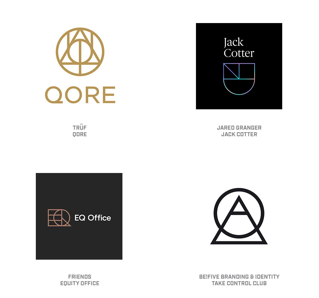
I’ll confess, the first impression of these marks left me wondering if a few designers have a crush on JK Rowling. The stone, the wand, and the cloak, incarnate from the Deathly Hallows. If these logo talismans have nearly as strong a tale to tell, they will serve their masters impeccably. One simply cannot look at these without believing every resolute stroke is placed in perfect harmony to the others and likely imbued with powerful meaning. I’m left feeling smarter for just having seen these.
The clarity of the earnest strokes, the perfected angles and immaculately radiused curves intersect like precision crosshairs. These instill a technical superiority to their owners and leave us with a sense of competent infallibility. Surely the context of the application of these marks demands an equally rigid environment with little margin for whimsy. If anything, these symbols may be just formal enough to sway you to arrive at their office in a freshly starched shirt.
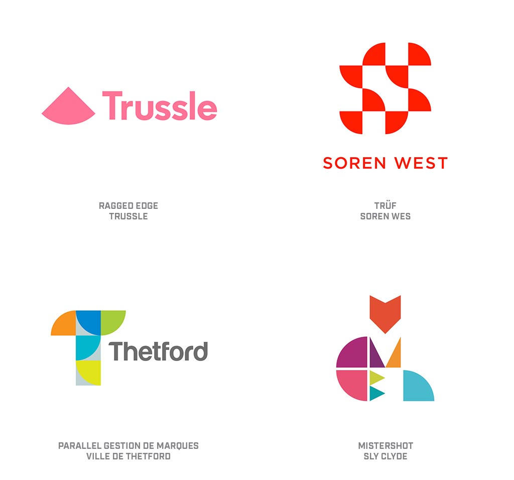
A continuation of theme from the last two years has been the move to simplification of design or purity of mark. This homage to clarity of structure and image from prior generations is proof of designers’ inventive nature as they noodle out solutions rearranging the same geometric parts and pieces that have been in play since Euclid was a tot. Whenever you hear someone express the belief that everything’s been done before, just remind them writers and musicians have been rearranging a handful of notes or letters and rendering new music and books for longer than logos have existed. Our well is nowhere near dry.
This year, the plethora of circles quartered and strewn about in a deliberate fashion can be found everywhere. Most often, these are the sole building blocks, but they’re also found mixed with circles, half circles, squares, triangles, and the other step-sibling array or geometric shapes. Purity of form continues to deliver a signal of simplicity or competence, even when representing a complex message. There continues to be a limit to the number of elements you can fit into a mark before it seems cumbersome. The Soren West mark is certainly an engaging solution but is a half-step away from the quarter circle capacity.
www.logolounge.com/articles/2019-logo-trend-report