QORE is adding more value
to investment gold
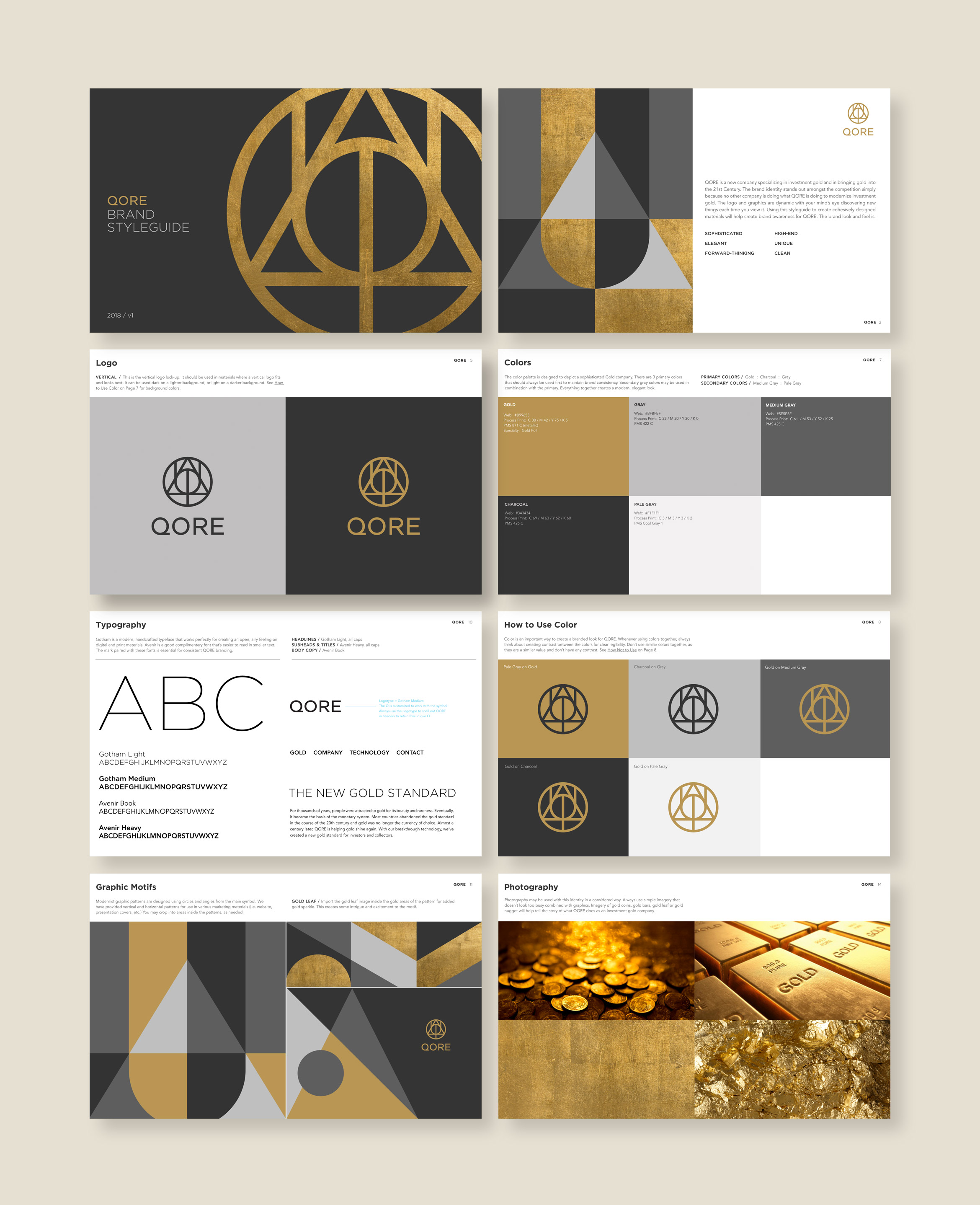
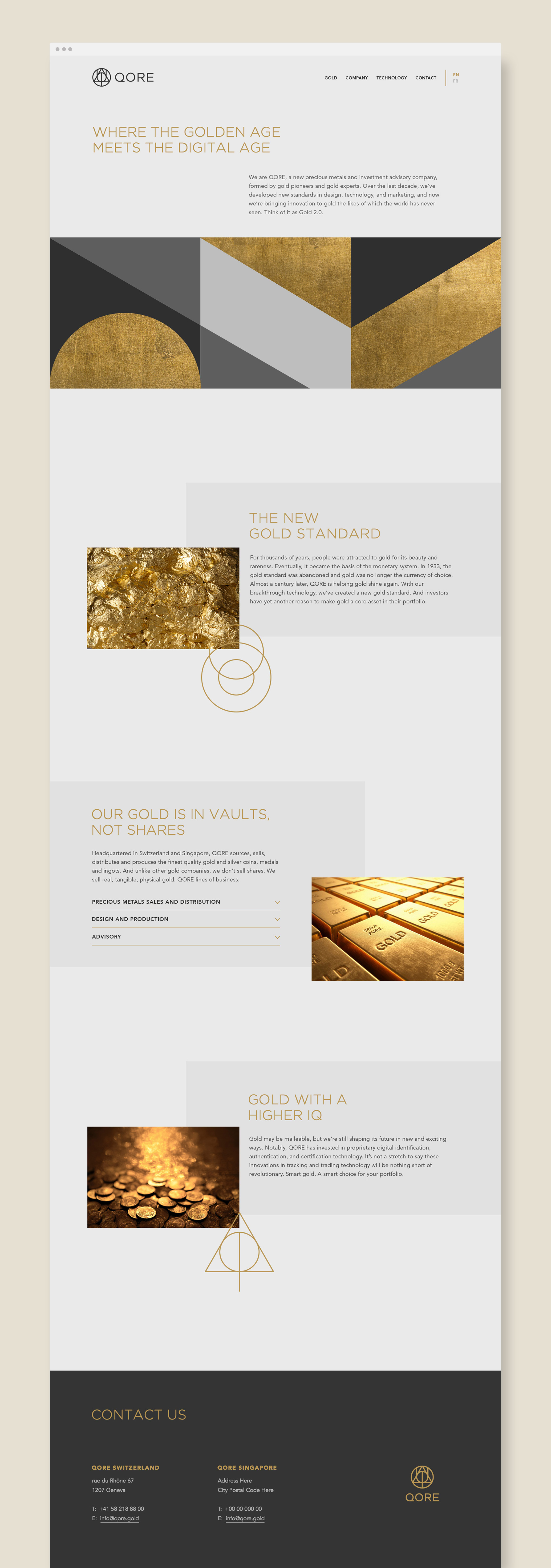
QORE is a Swiss-based precious metals and investment advisory formed by world-renowned gold experts. Over the last decade, they’ve developed new standards in design, technology, and marketing to modernize investment gold. The new brand identity reflects their core values of quality, creativity, innovation and infinite discovery through this precious metal.

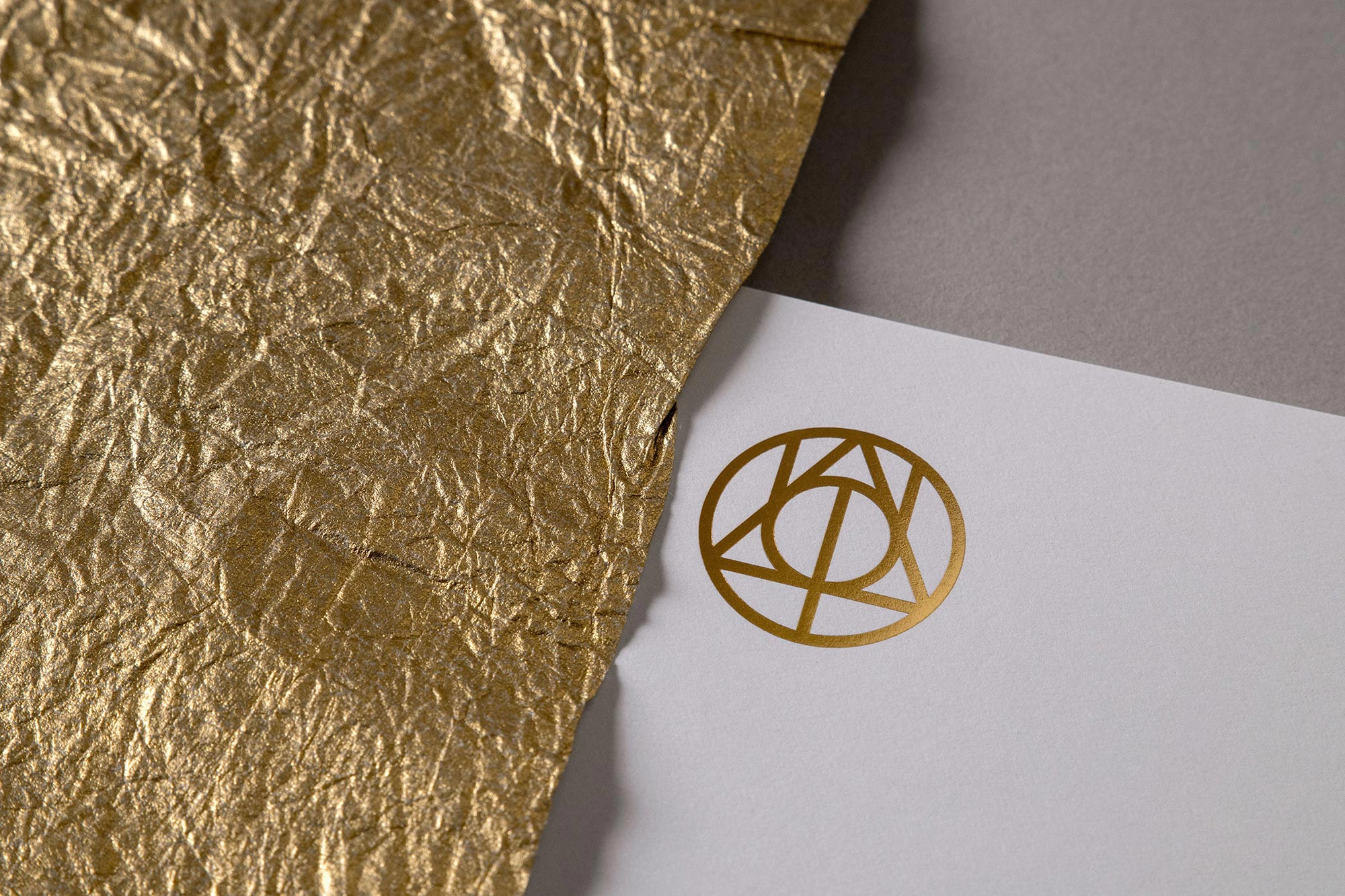
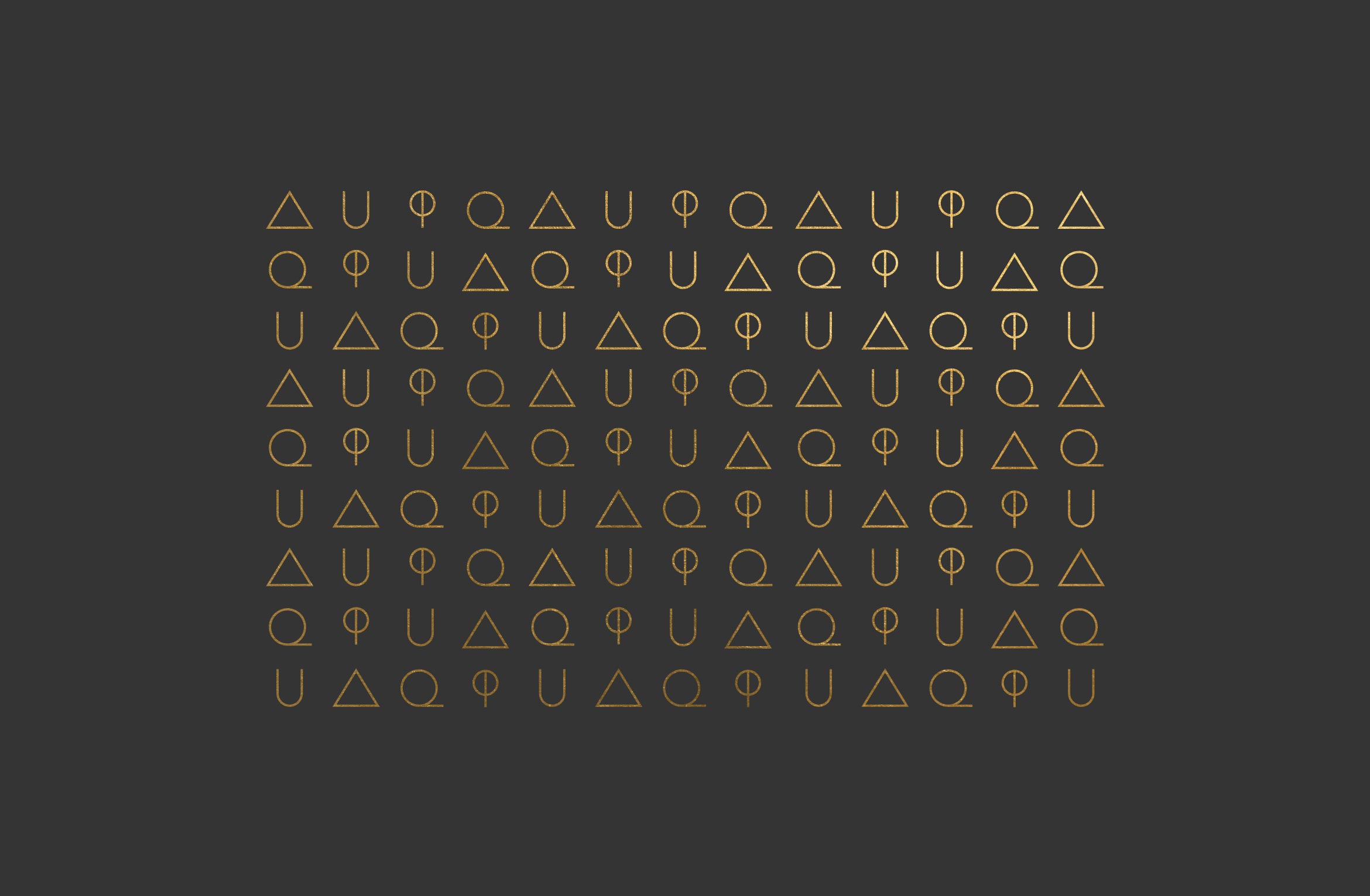
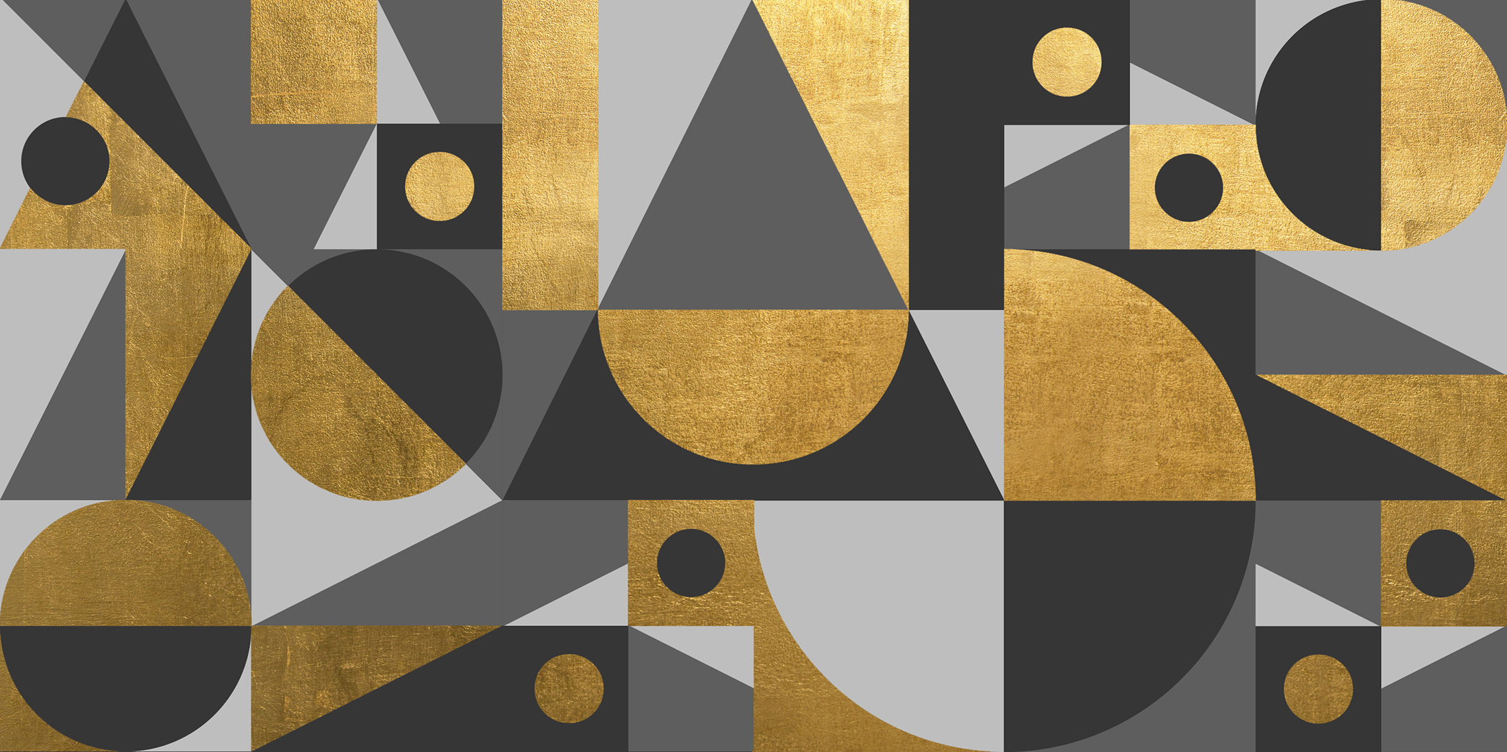
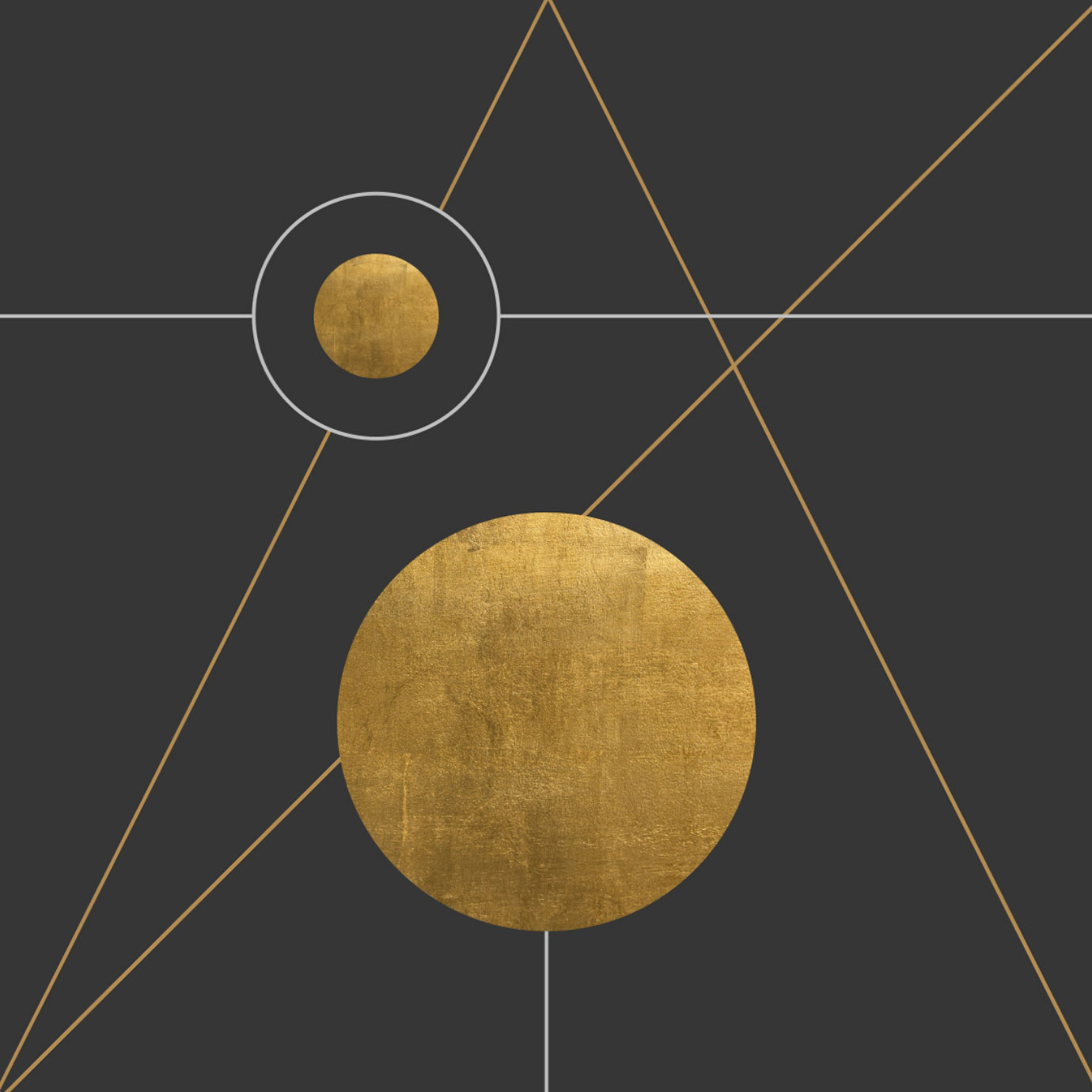
The mark is composed of three symbols that echo sacred geometry and have a guild-like quality. Geometric shapes like triangles, circles and lines can be pulled out to configure endless motifs and supergraphics that extend the brand’s visual system.
AU: Periodic Table
Phi: Symbol for Golden Ratio
Q: Qore

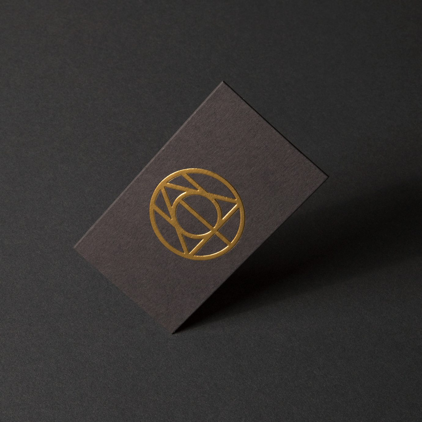
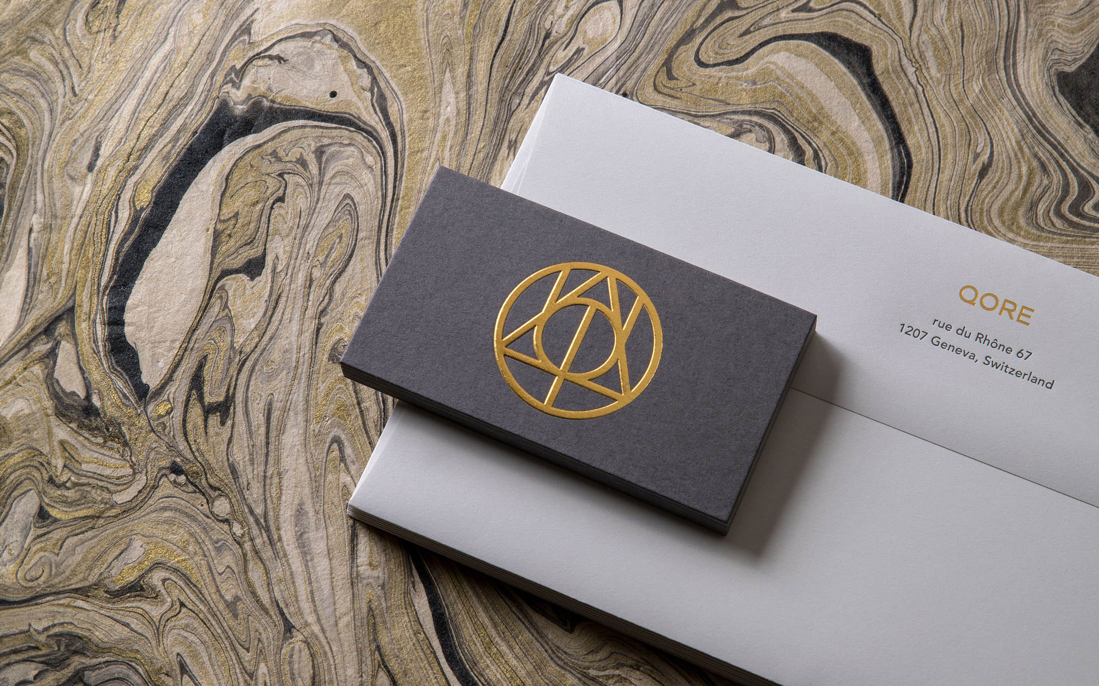
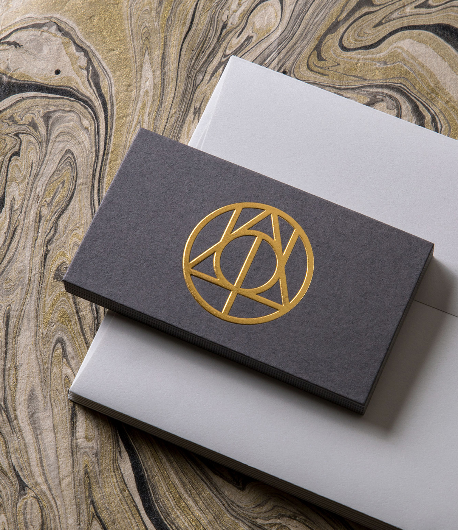
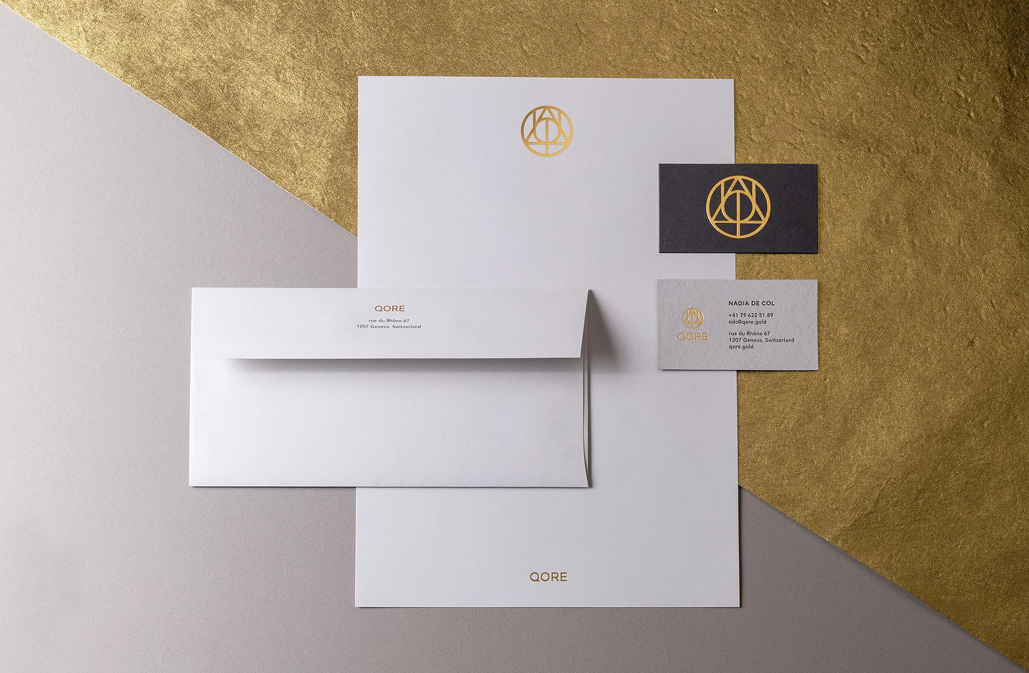
High-end business cards were printed using ColorPlan duplexed grey papers, letterpress and an embossed gold foil logo that feels like a gold coin. Matching Classic Crest Antique Gray and Gold Foil envelopes and letterhead round out the stationery suite.
Deliverables:
- Brand Identity
- Brand Guidelines
- Visual System
- Print Collateral
- Web Design
- Copywriting
A bilingual, single page website tells the story of what QORE has to offer using smart copy and collaged imagery. Animations of the logo and icons, paired with parallax layers adds a unique, modernist touch.
A Brand Styleguide outlines rules for logo lock-ups, color formulas, typography, how to work with graphic motifs and photography.