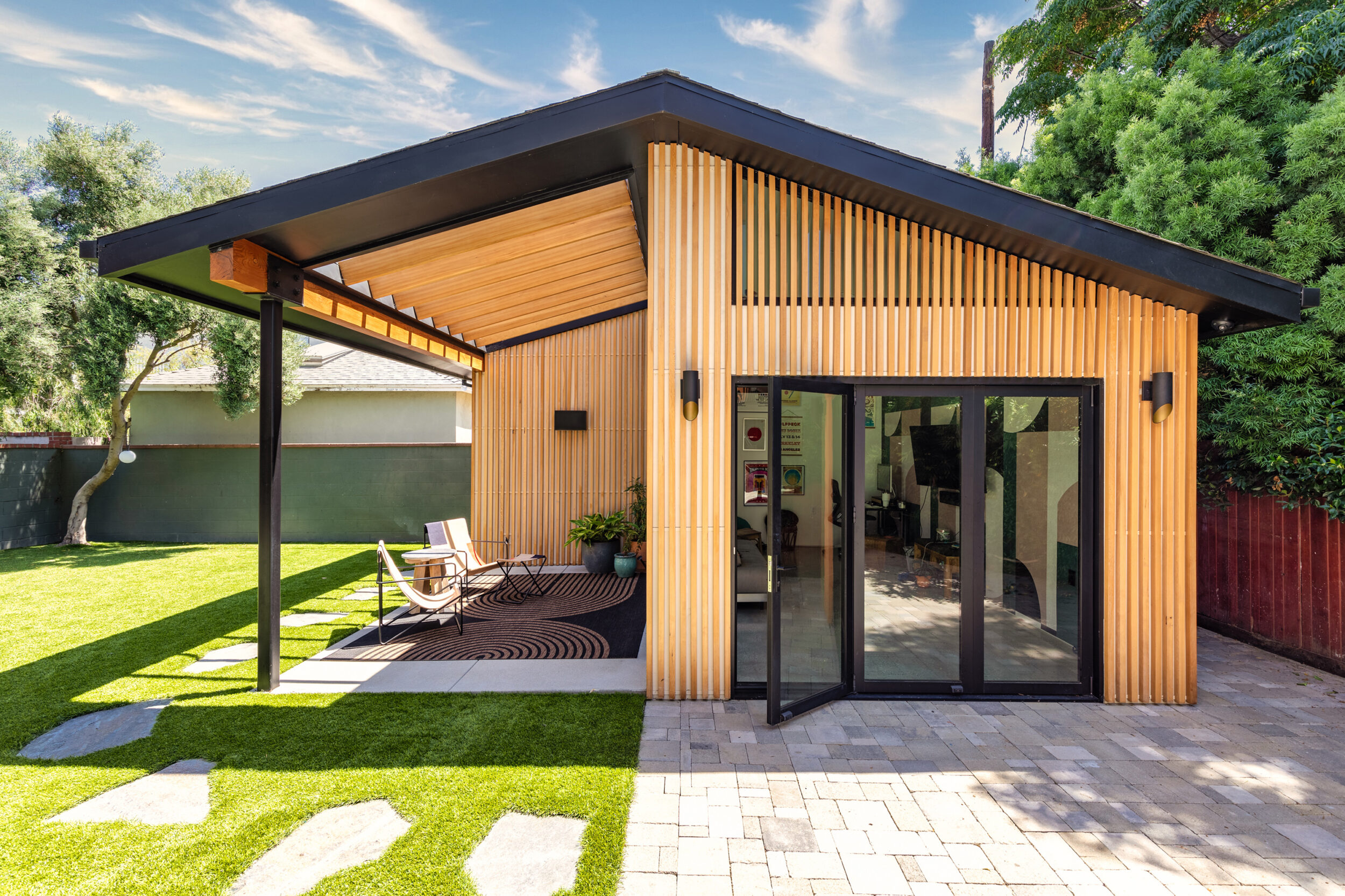
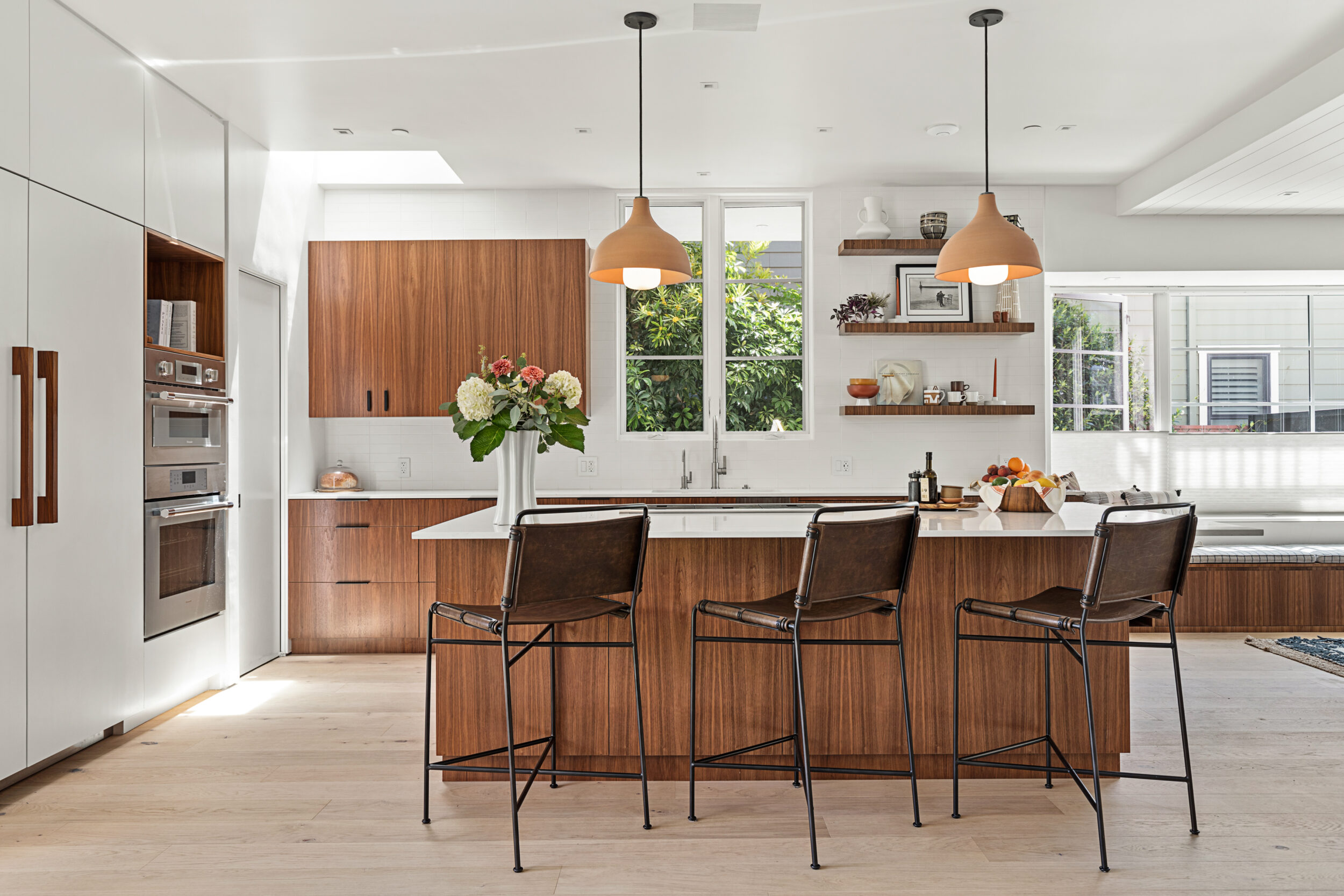
Reliance designs + builds homes that function as beautifully as they look
Reliance is a Los Angeles-based design and build company driven by design-forward thinking. Their new brand identity and website was built to reflect their commitment to building contemporary homes with precision, simplicity and meticulous service.
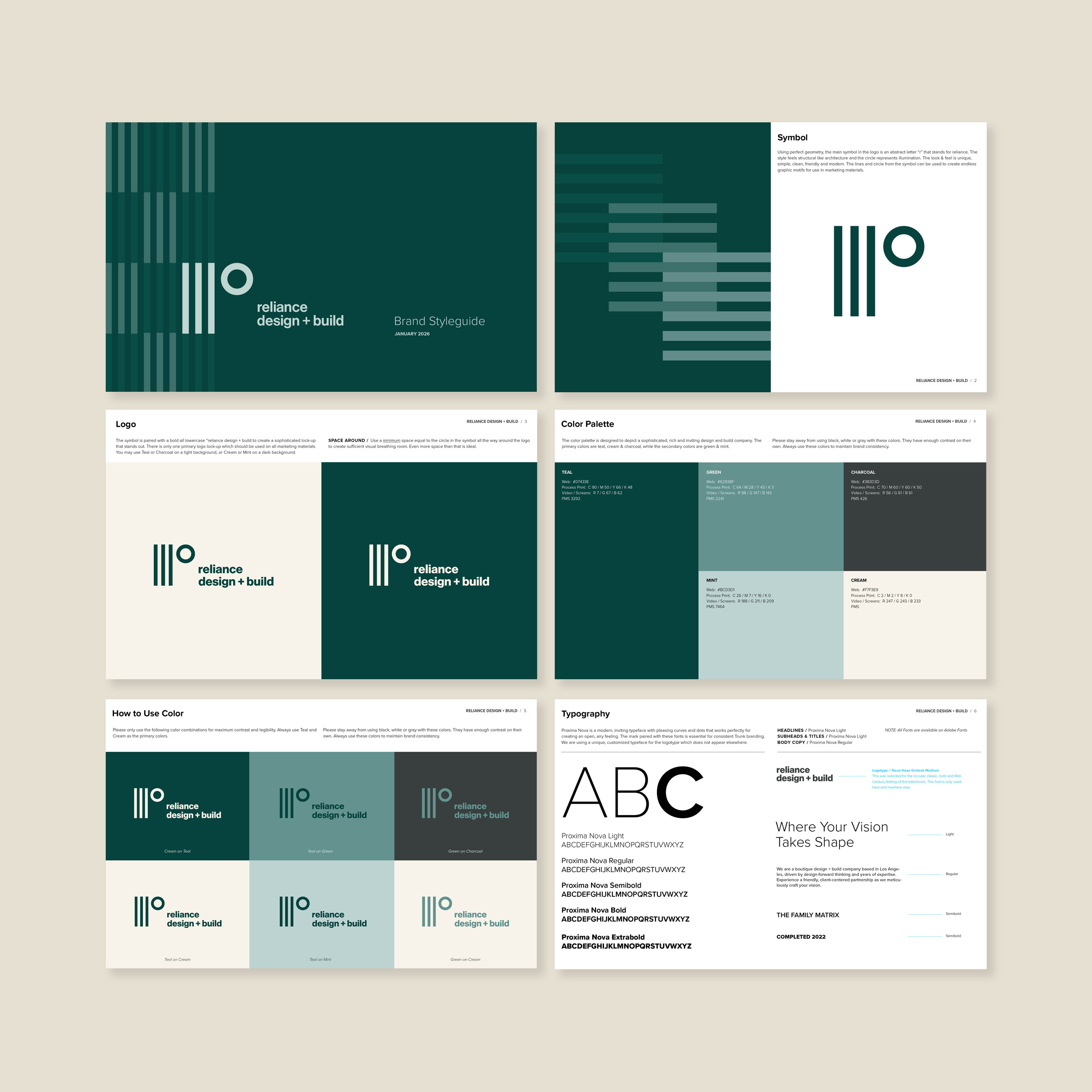
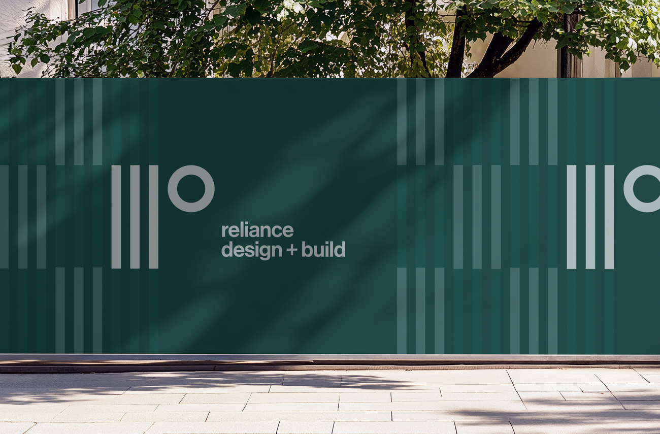
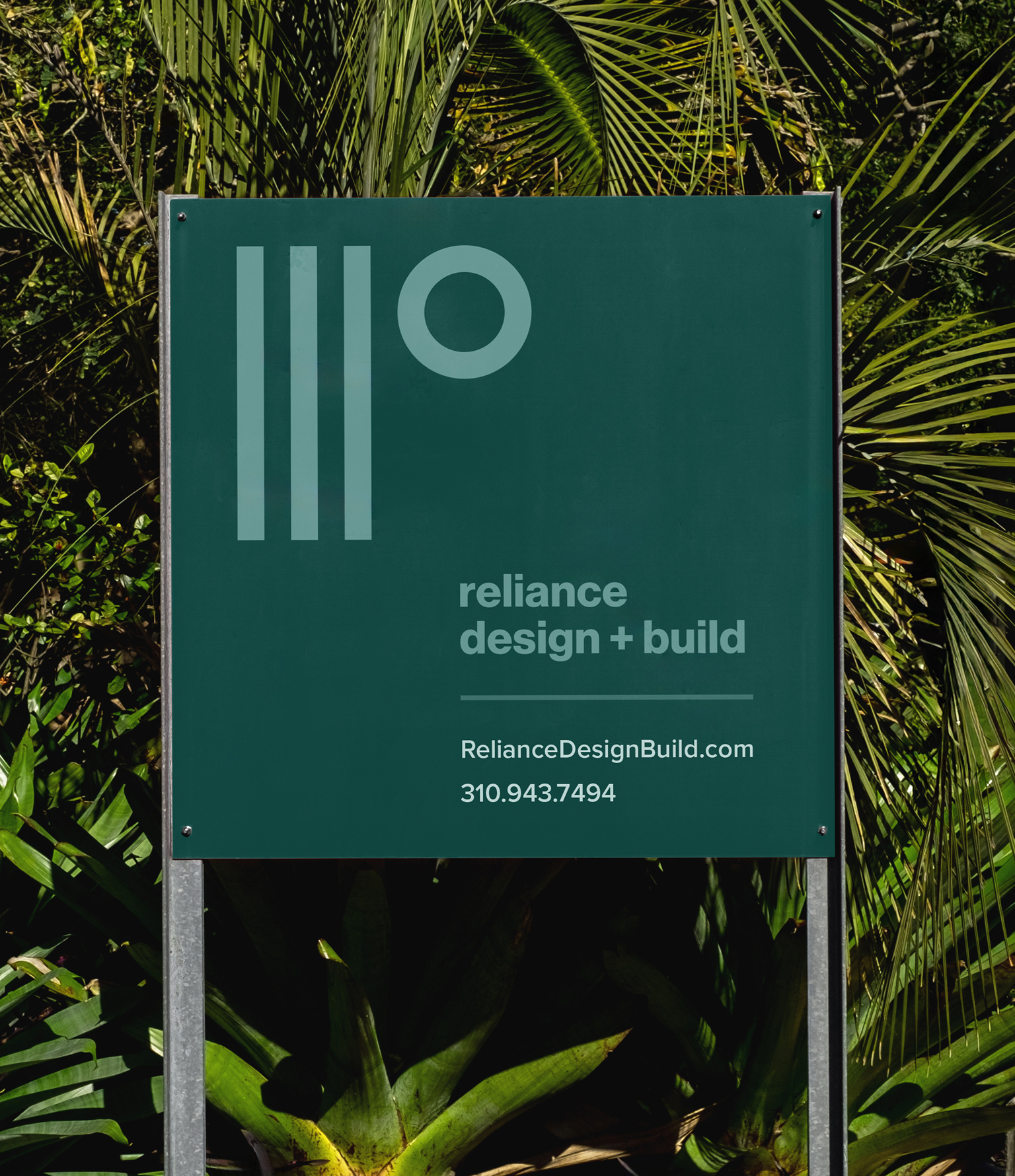
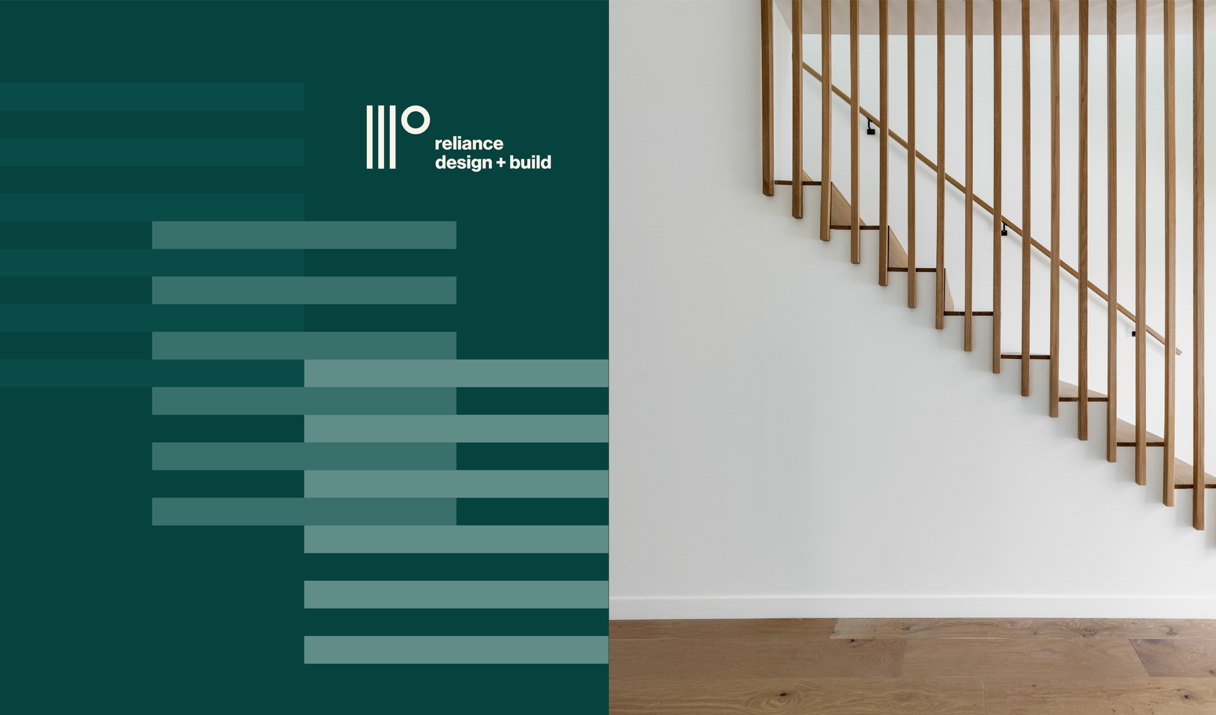
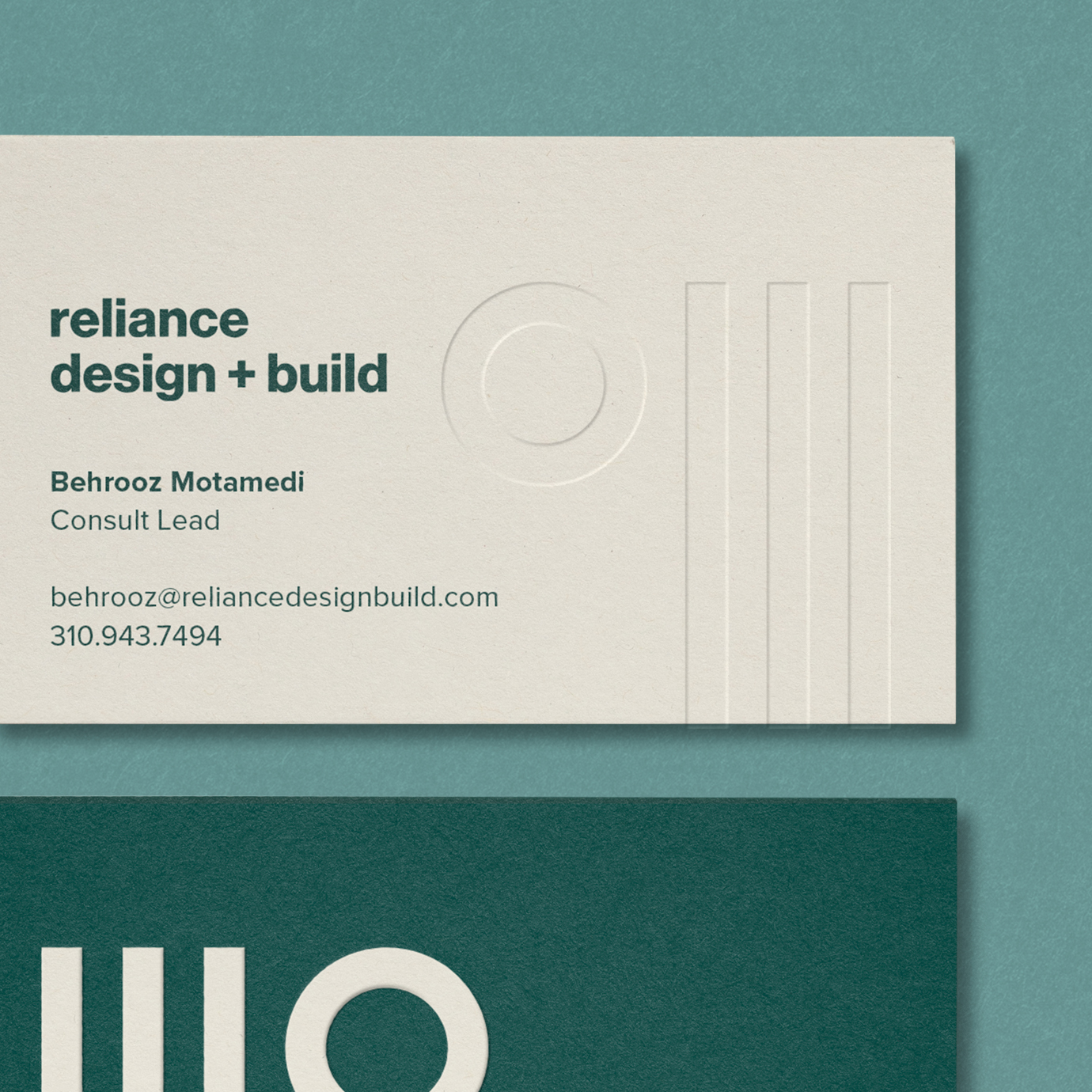
The main symbol in the logo is an abstract lowercase “r” constructed with precise geometry and balance. The style reflects the precision, simplicity and structural nature of their architecture. The three beams also represent the founding partners while the circle acts as a rising sun bringing their projects to light.
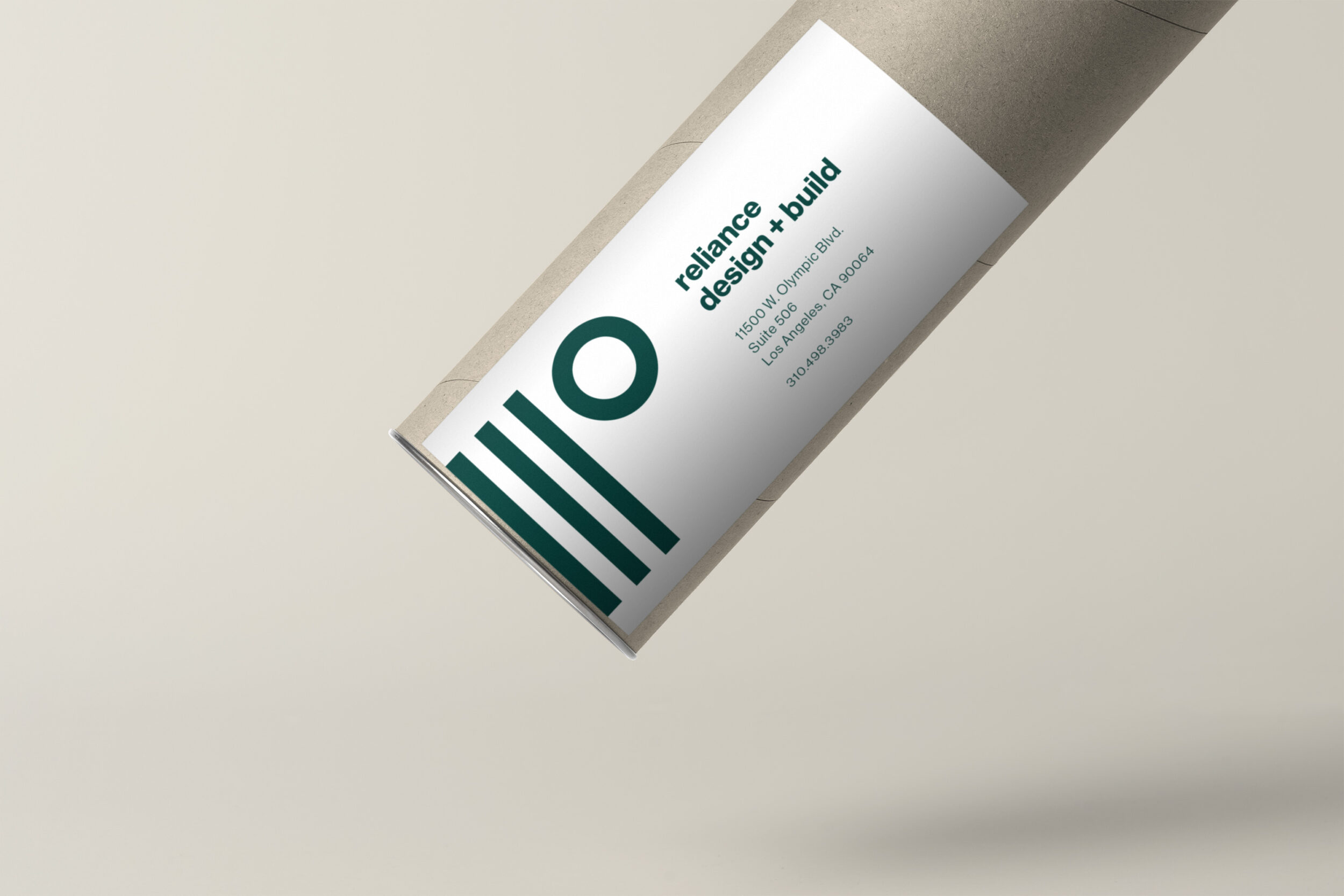
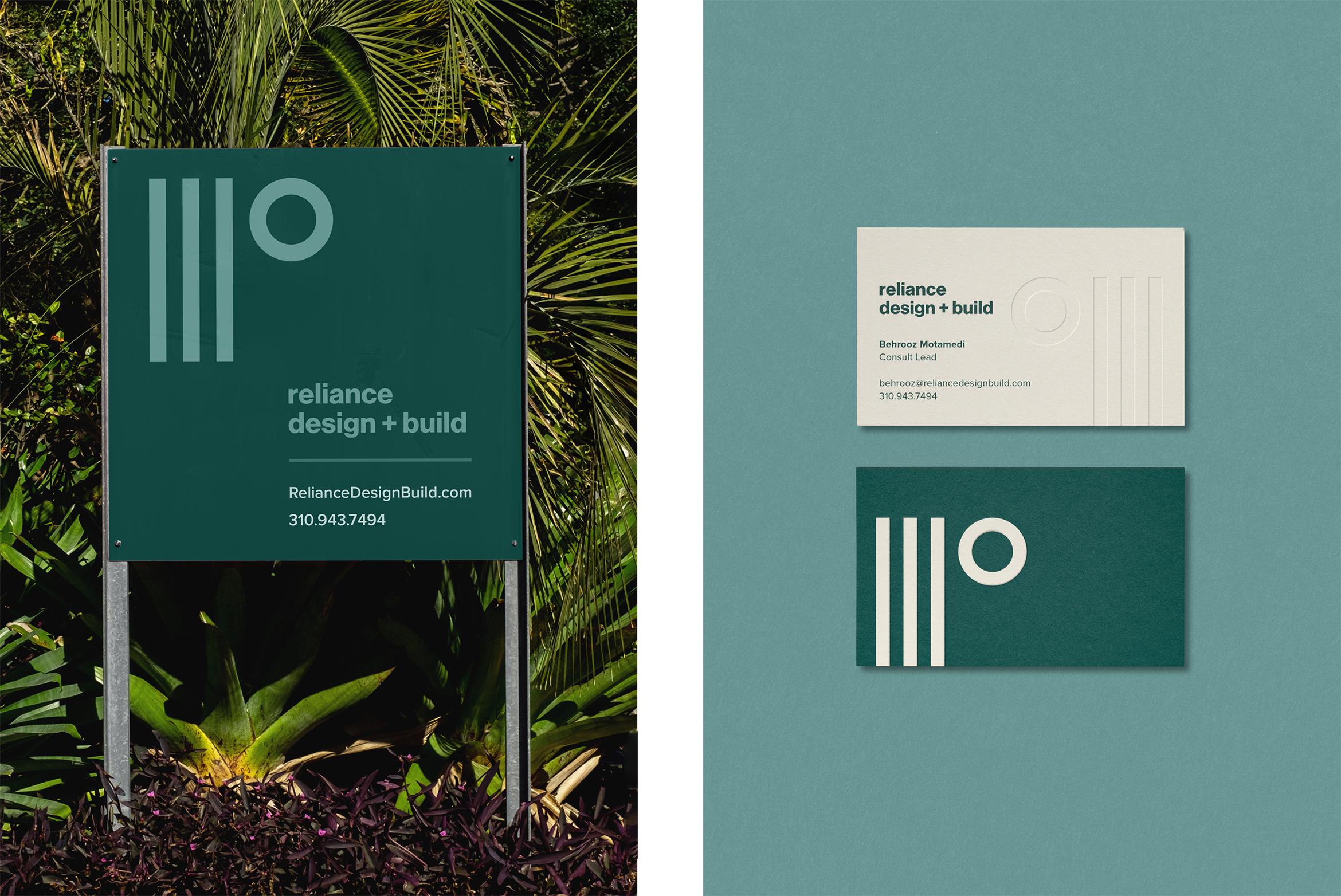
The bold lines and circle from the symbol can be used to create endless graphic motifs for use in various print and digital marketing materials.
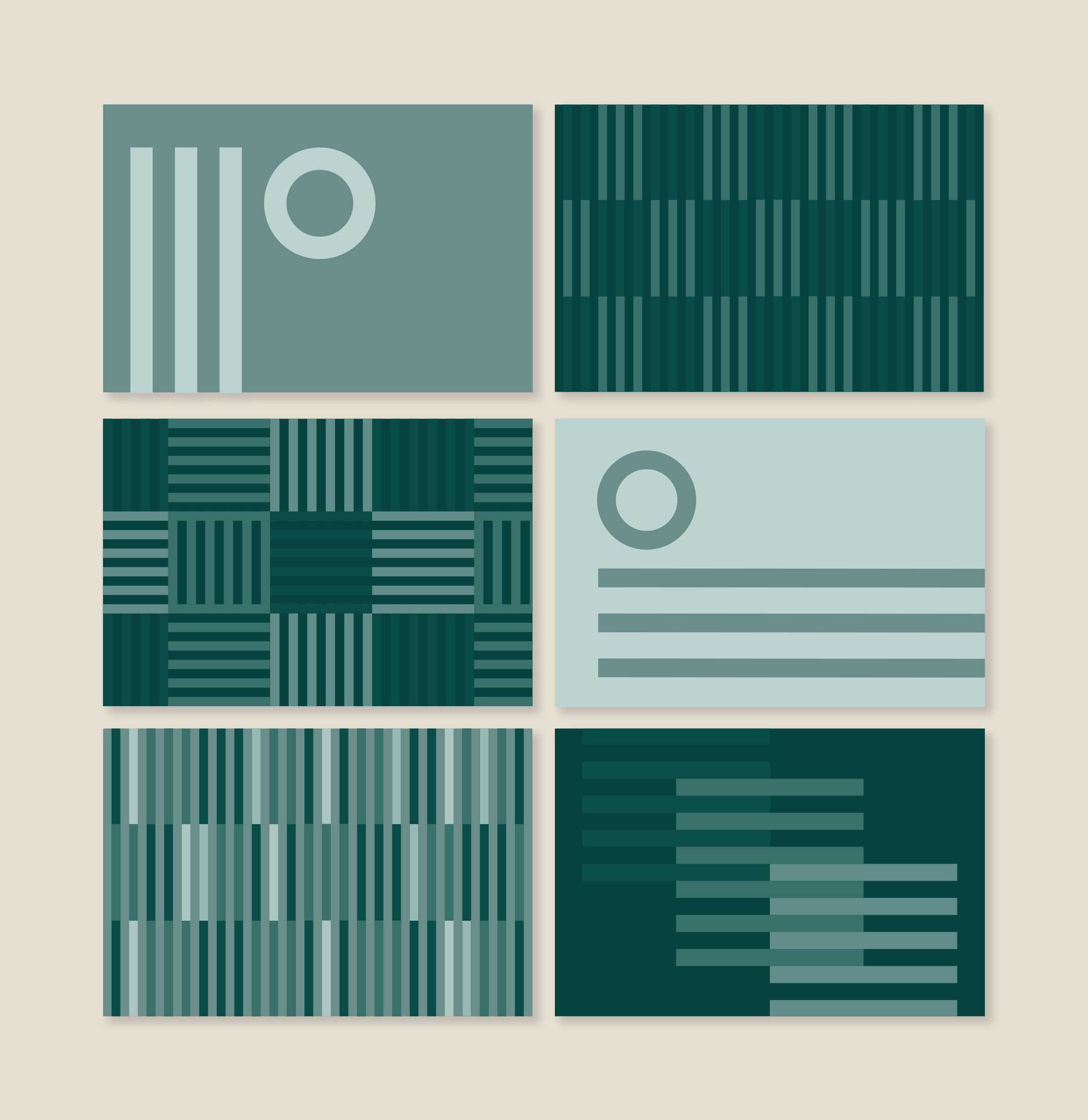
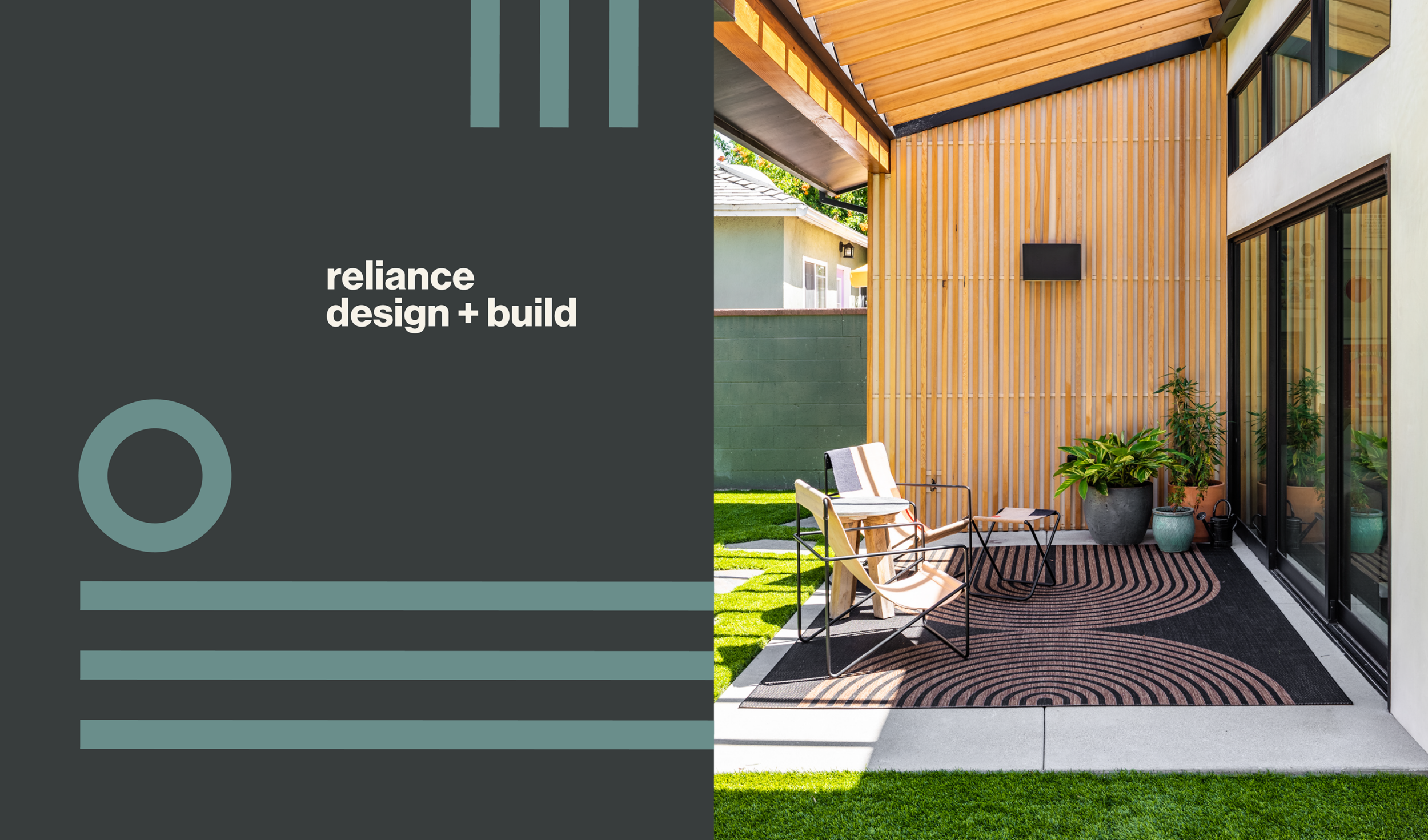
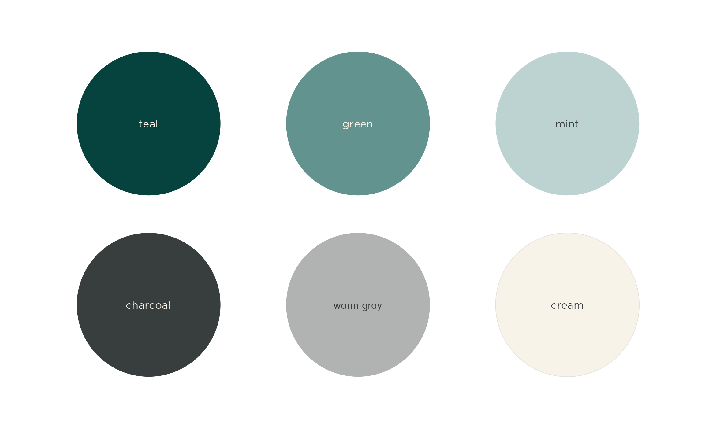
The brand color palette is warm, inviting and neutral to juxtapose nicely with project photography. Green symbolizes growth, while cream and charcoal are clean and crisp.
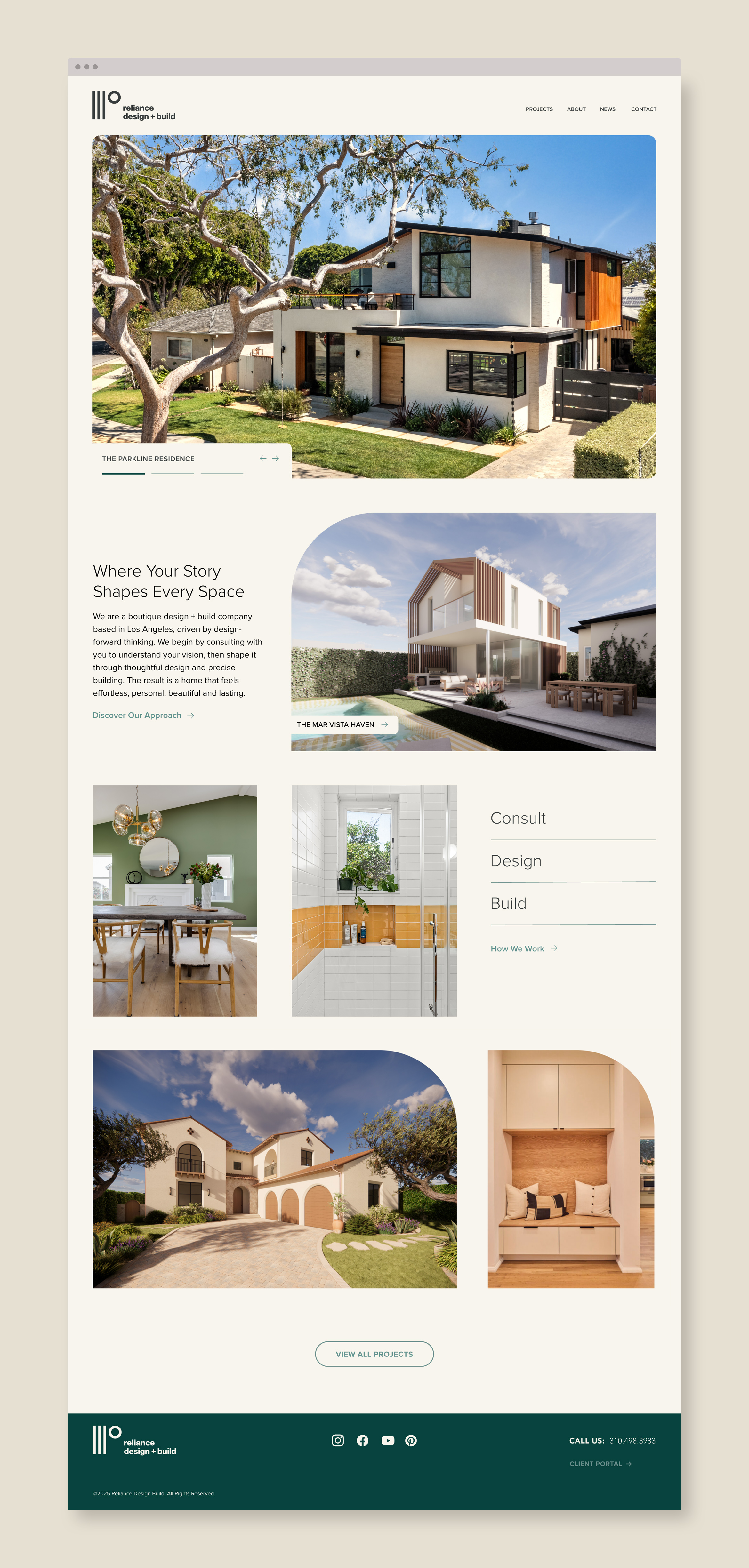
A clean, custom website was created that features case studies of Reliance’s most beautiful home builds. Unique functionality like auto-playing videos, design features and captions are included throughout.
Deliverables:
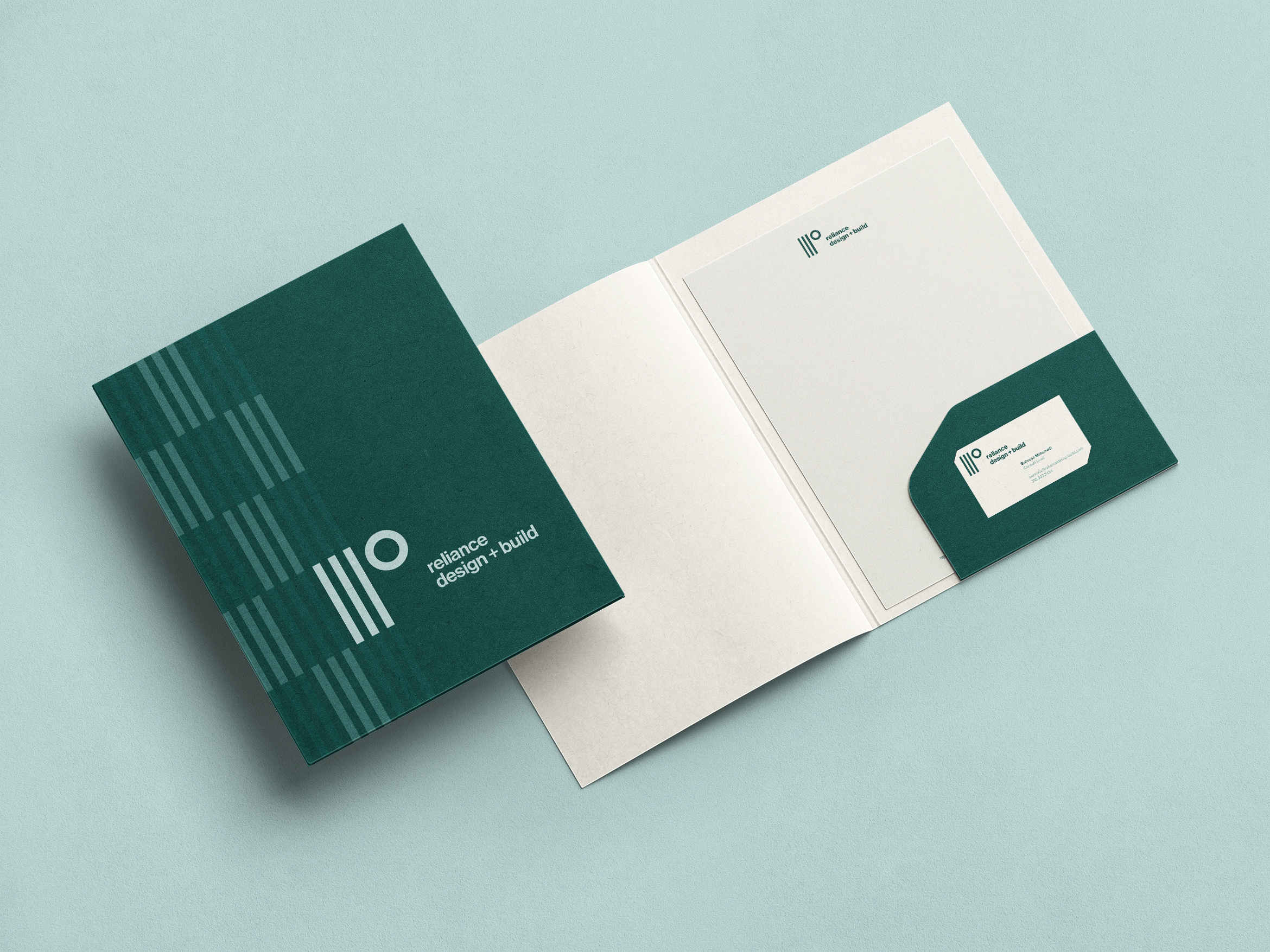
- Brand Identity + Visual System
- Brand Styleguide
- Print Collateral
- Web Design + Development
- Copywriting
- Construction Signage