
Qualcomm Institute jumpstarts innovation with technology and research
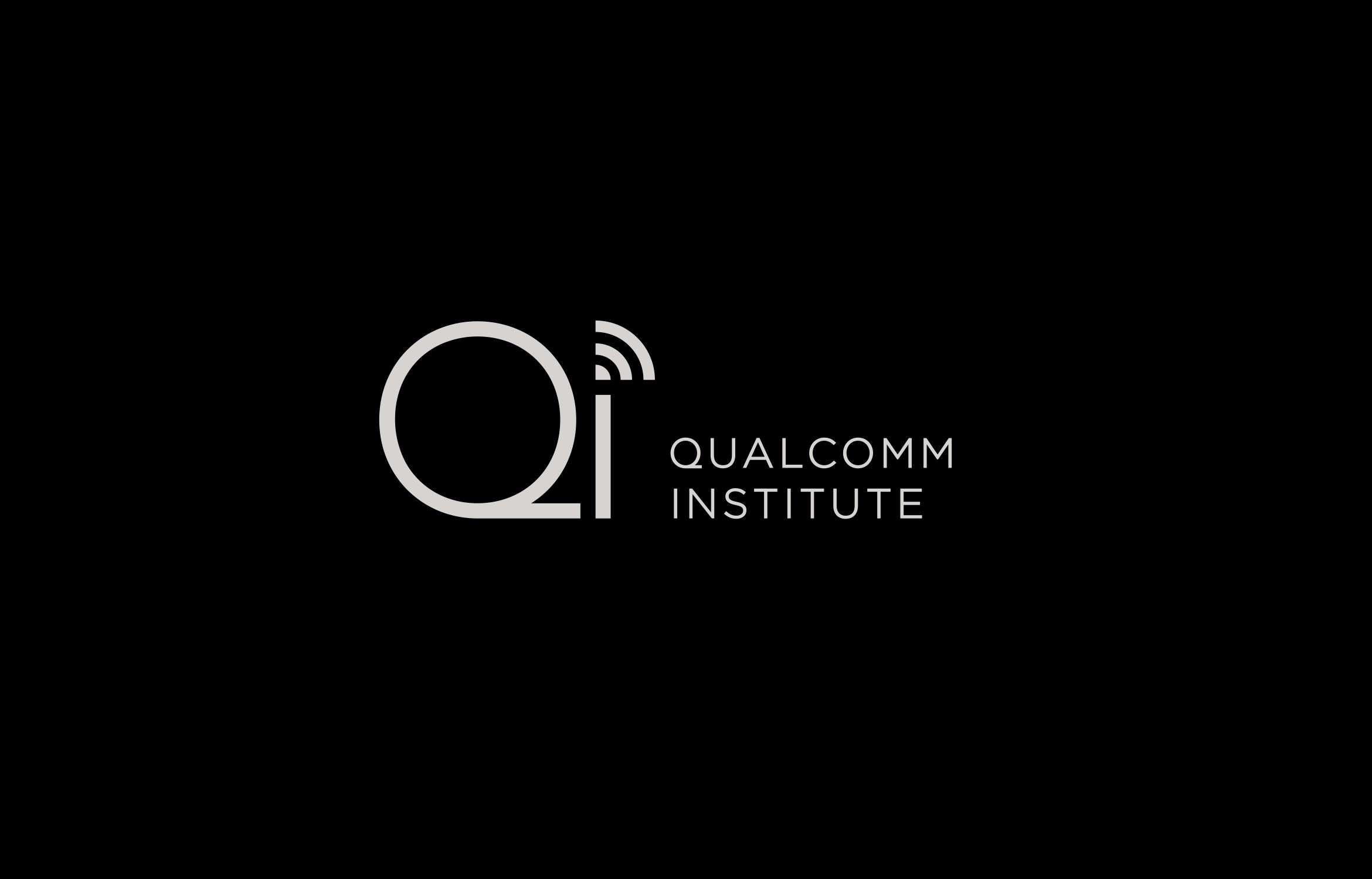
The Qualcomm Institute (QI) is a nonprofit research organization bringing together teams from all different cutting-edge technologies at UC San Diego. Founded in 2000, QI wanted to keep their existing mark, but refresh the visual identity and color palette to feel separate from the University of California’s yellow and blue branding. We started with an updated logo lock-up that feels cleaner, more organized-looking and easier to read.


A visual system of graphic motifs was created using the circle and wave from the QI mark as the main geometry. Various color combinations create hero banners for the website and blog.


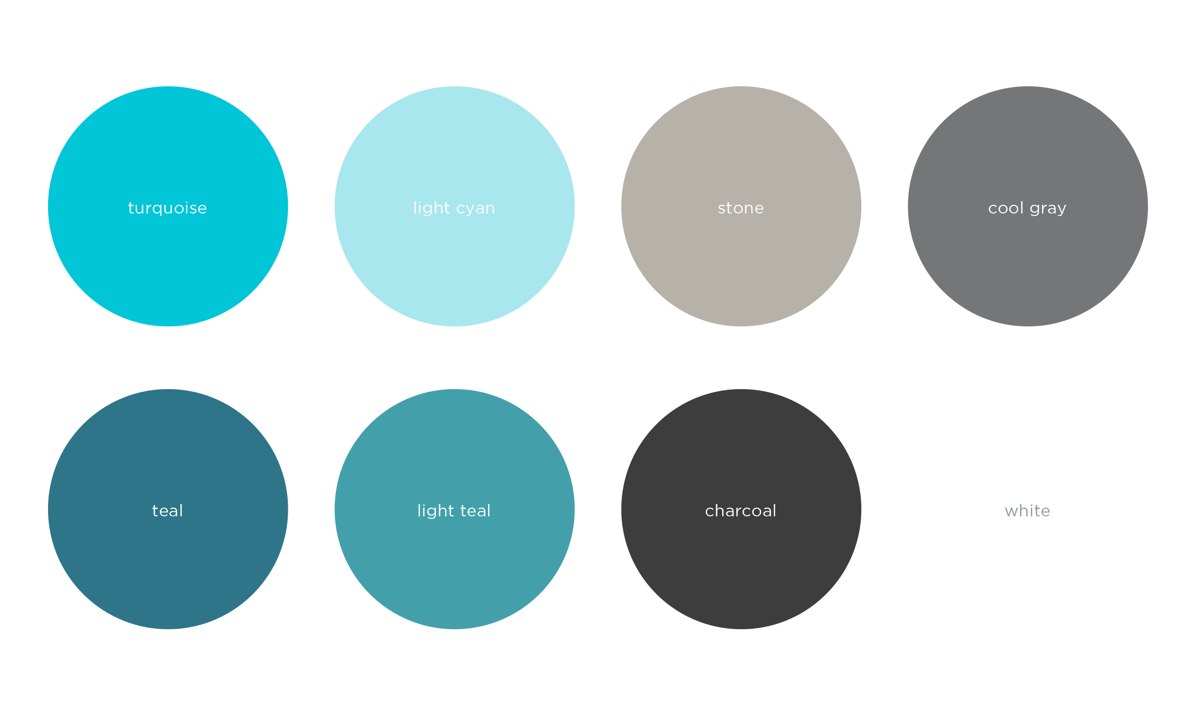
Working with the existing UC San Diego brand colors, we focused on the turquoise, stone and cool gray and added teal for a monochromatic look. The feeling is both confident and contemporary.

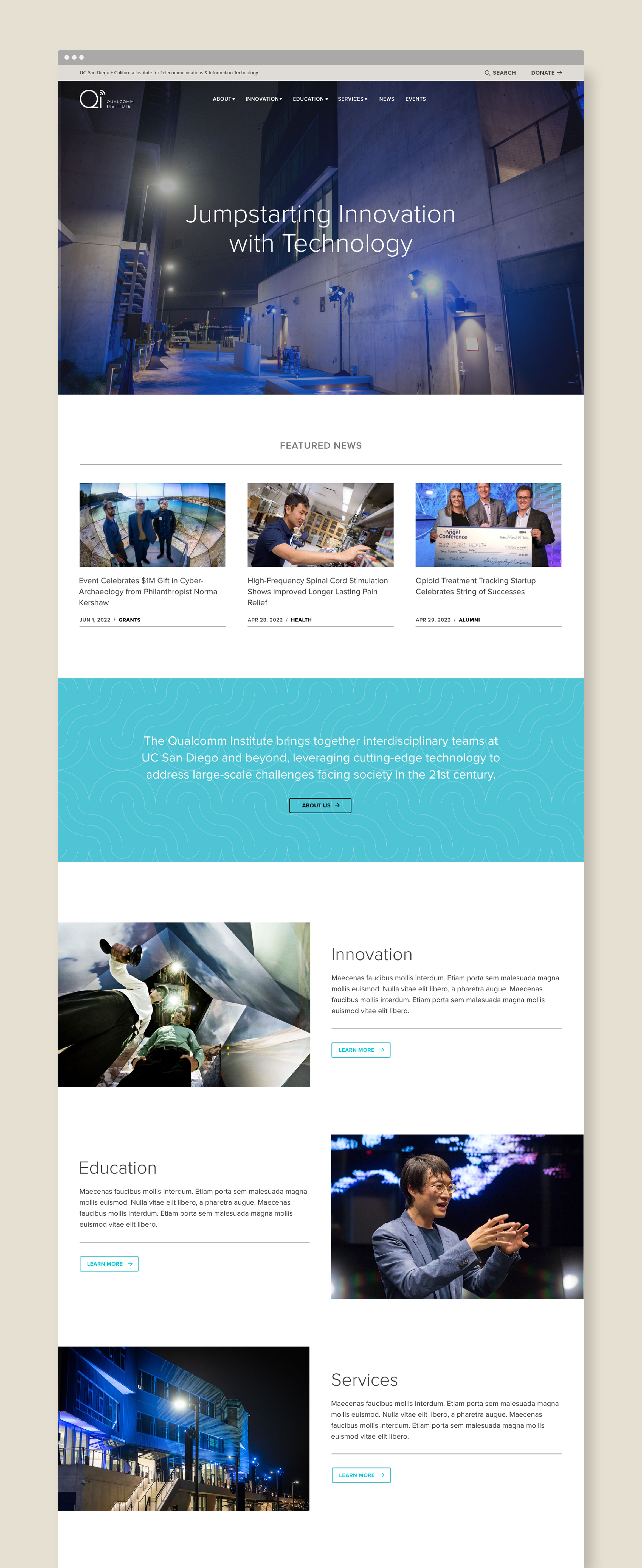
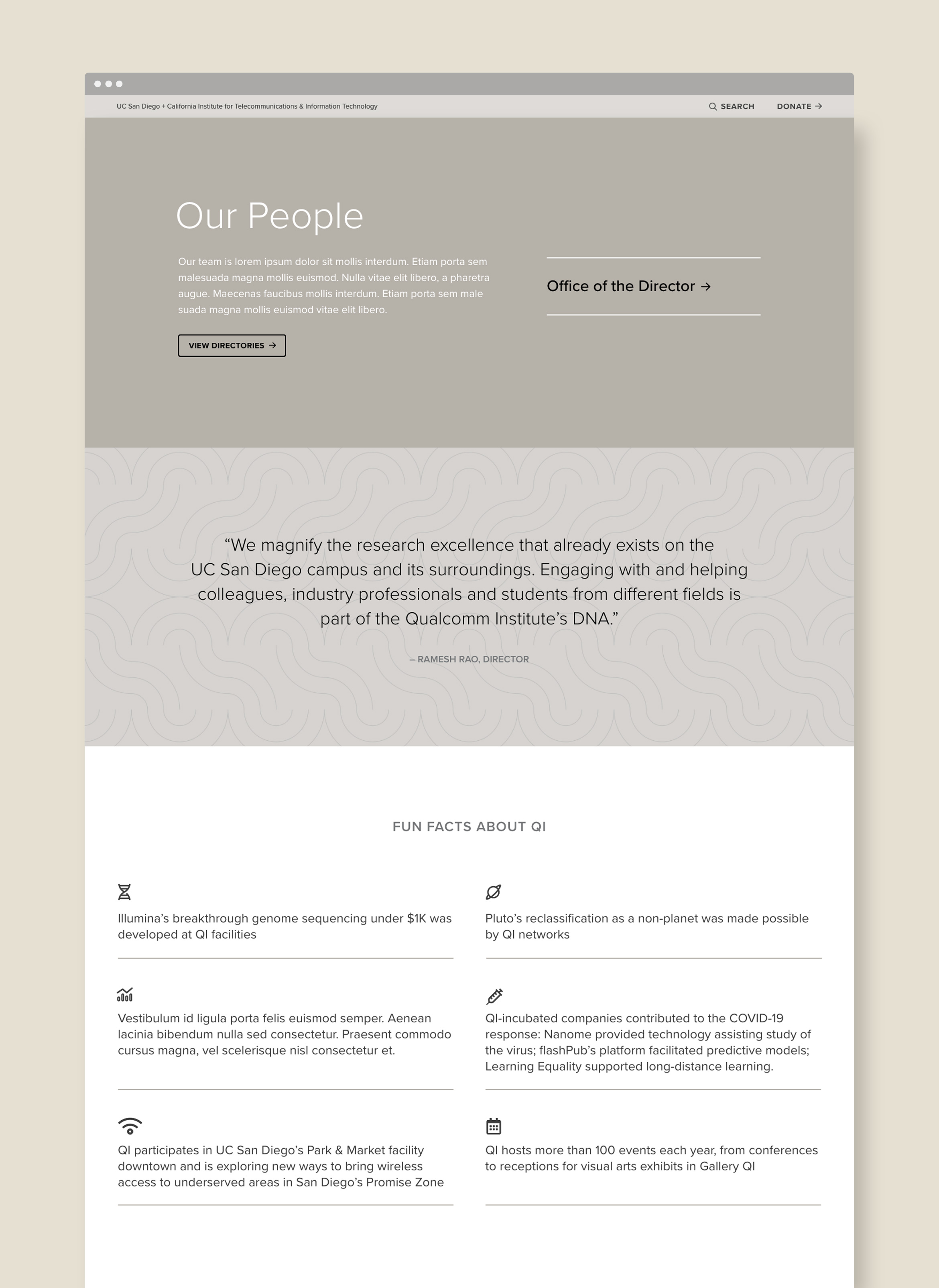
After an extensive site audit and wireframing phase, we completely redesigned their existing website. The result is well organized, easy to navigate and incorporates the new color palette.

Deliverables:
- Brand Refresh
- Visual System
- Web Design
- Web Development
- Content Creation