Calexo brings a smile to your mind in citrus rose or cucumber citron
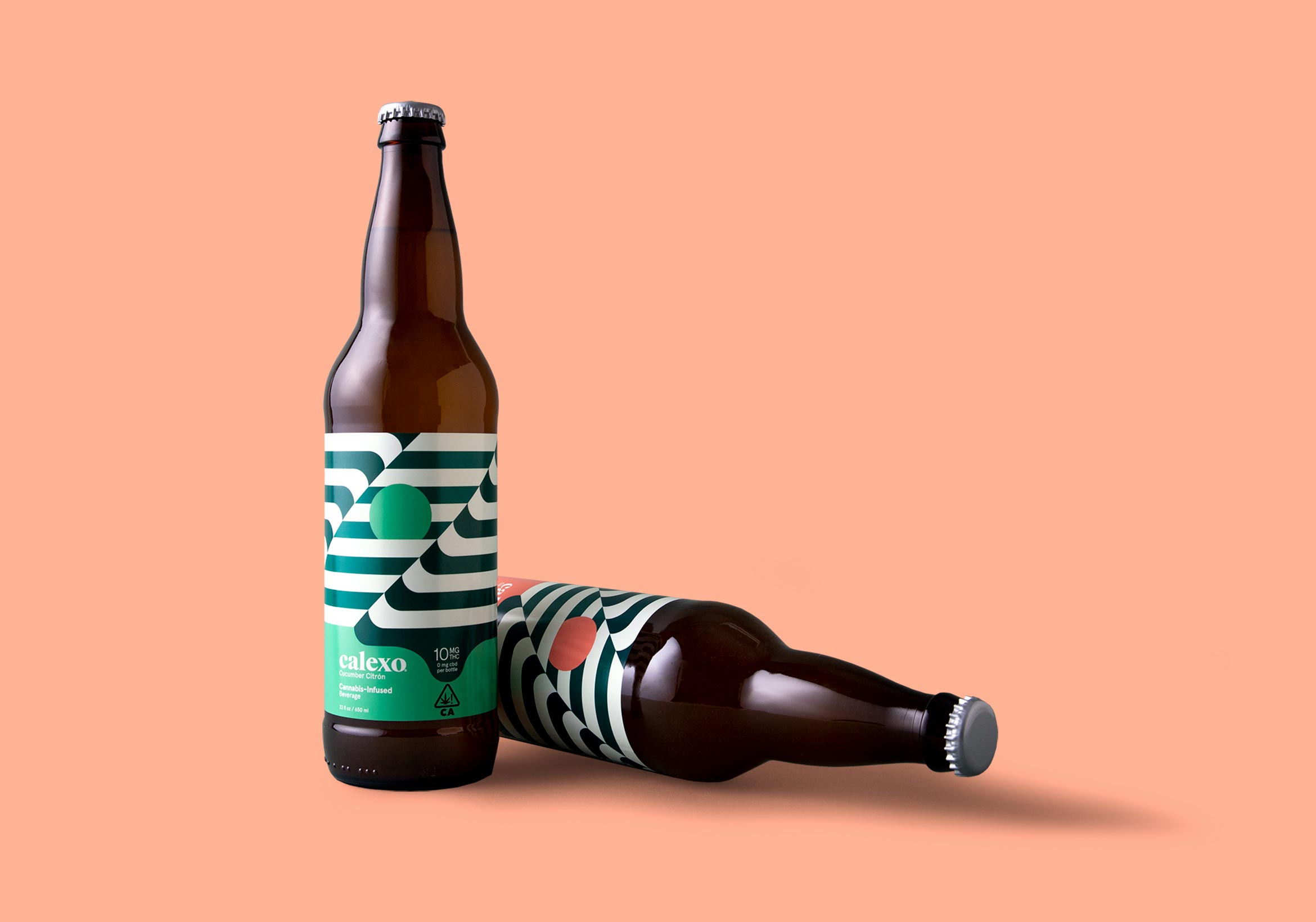
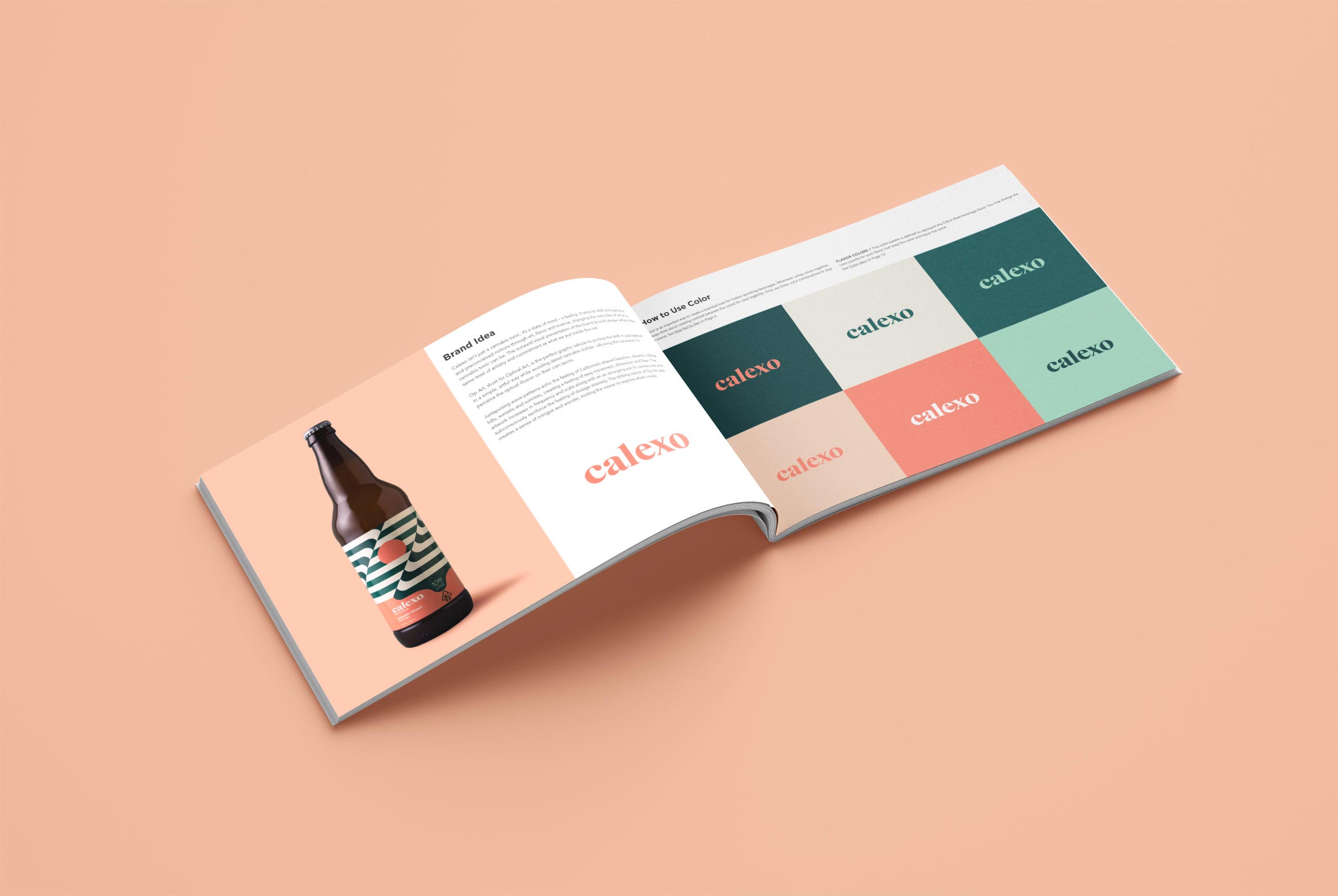
Calexo isn’t just another cannabis beverage, it’s a state of mind. It aims to shift perceptions and preconceived notions through art, flavor and science. Op Art “optical art” is the perfect graphic vehicle to portray this shift in a simple, artful way while avoiding dated cannabis clichés – allowing the consumer to perceive the illusion in the art on their own terms.
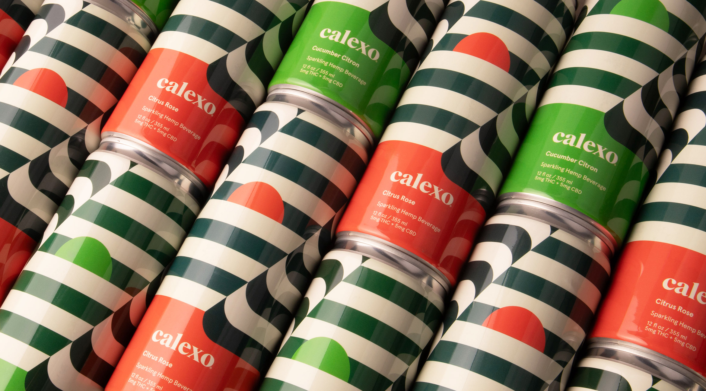
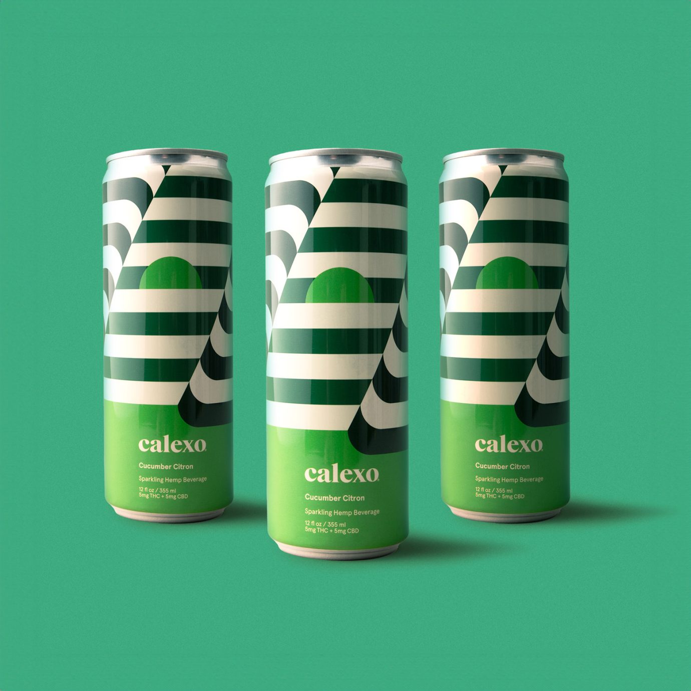
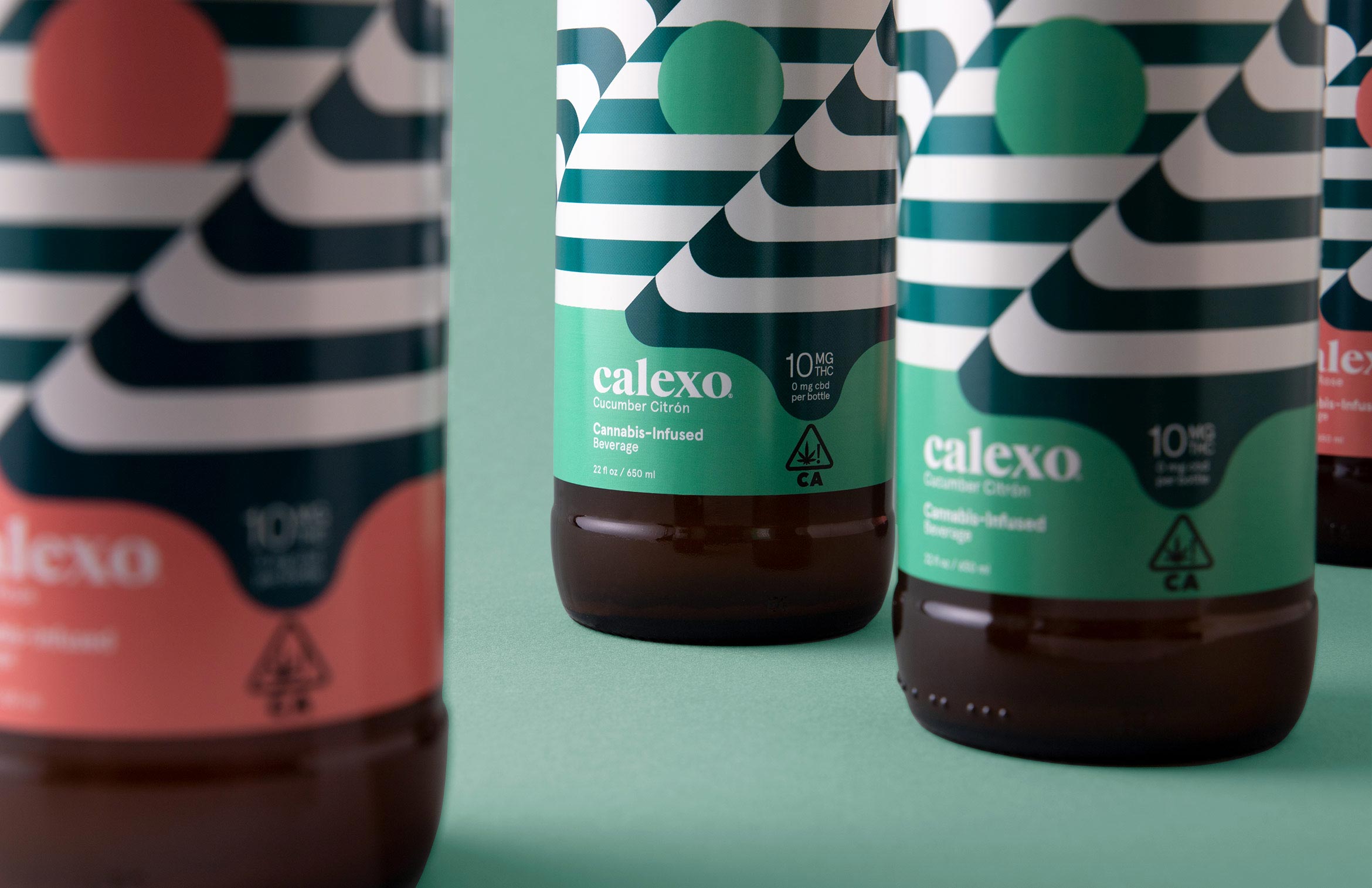
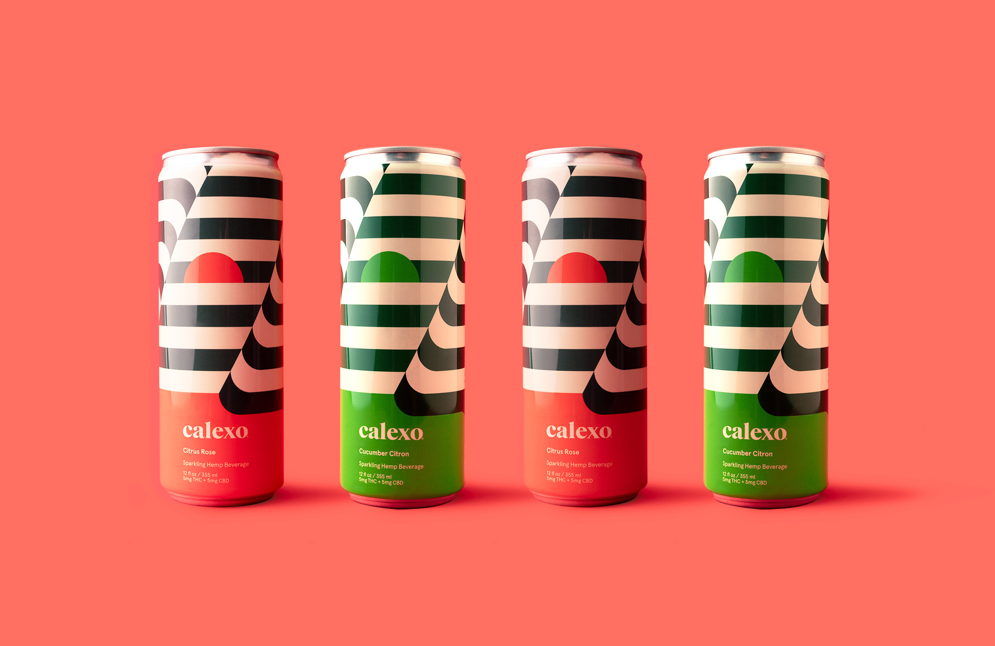
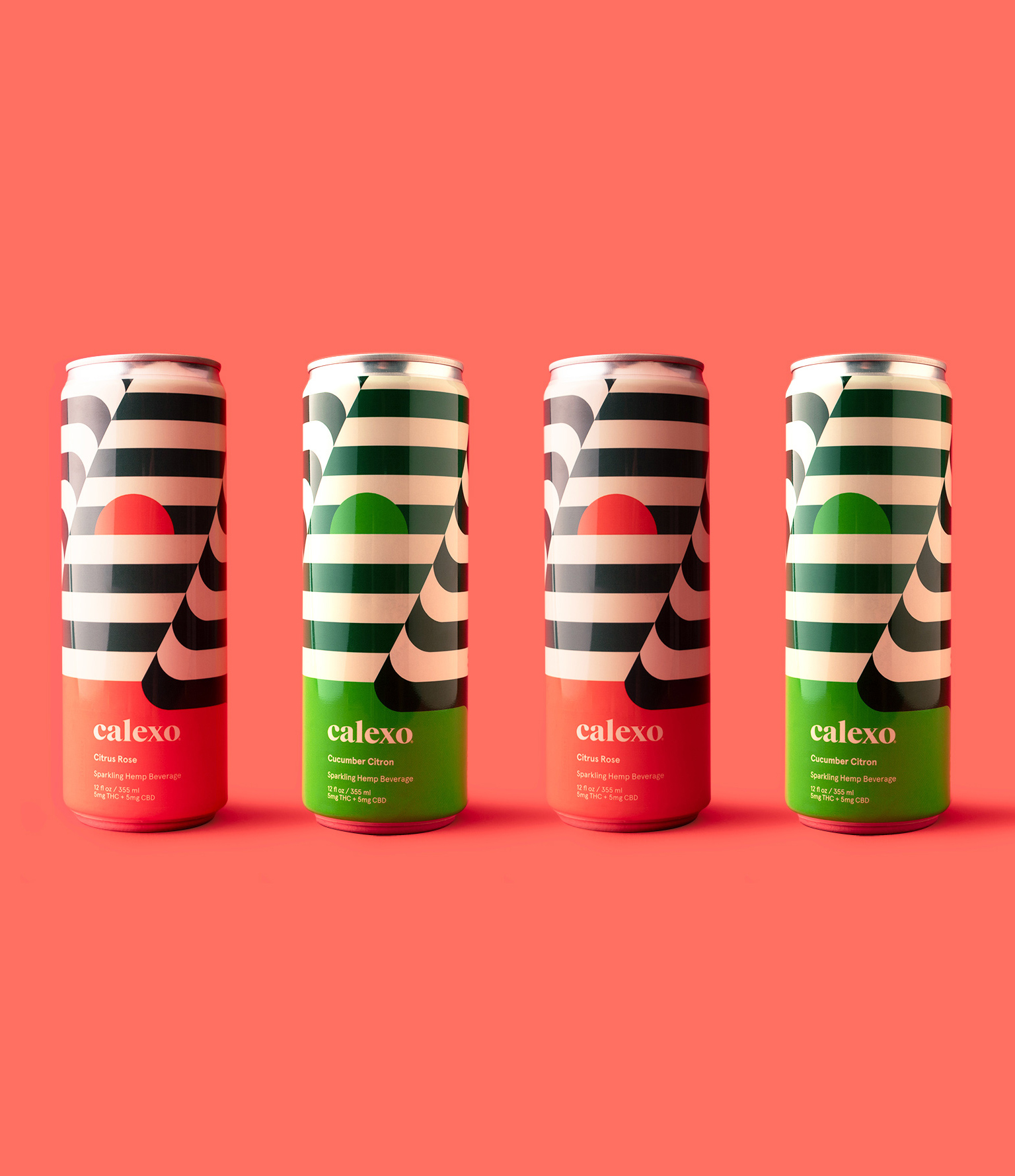
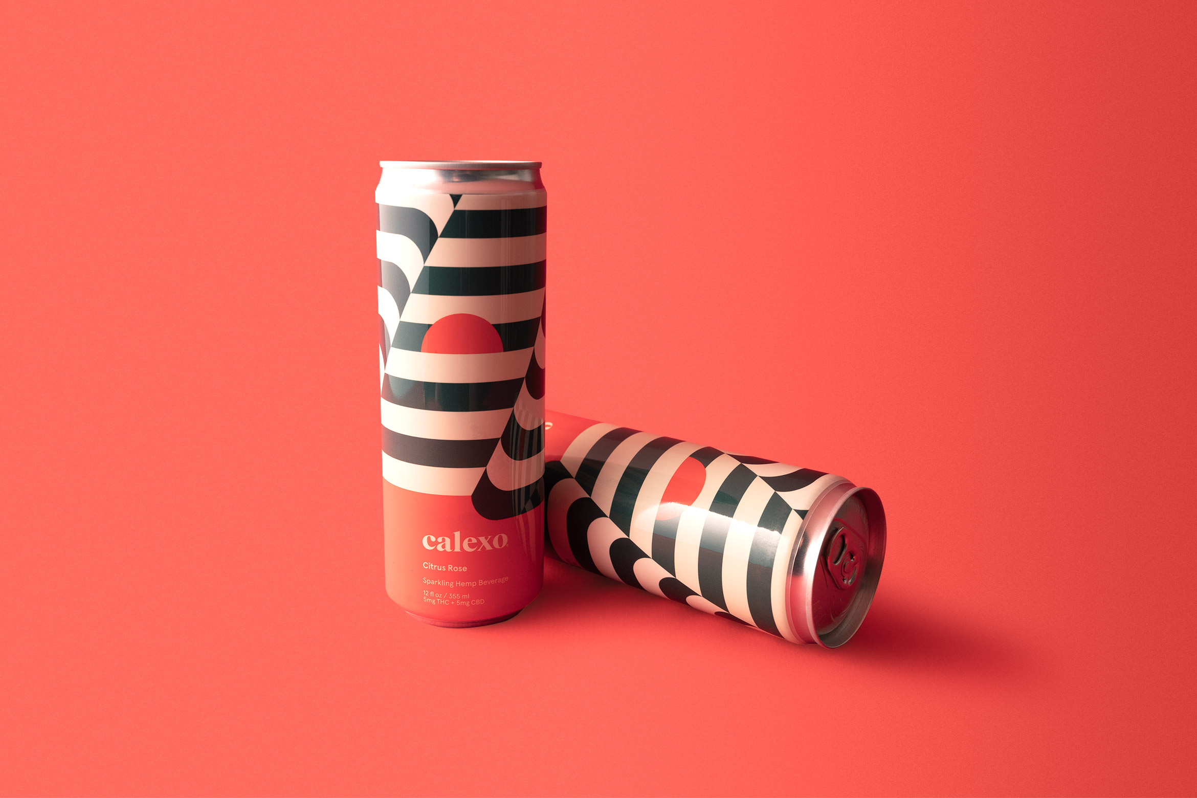
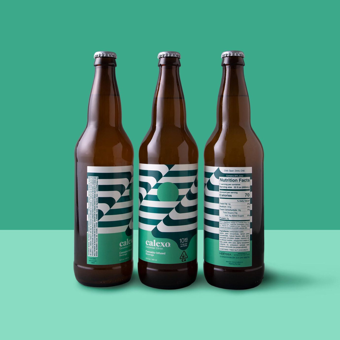
The new hemp beverage packaging is a 12 oz. can with a striped op-art wrap that continues seamlessly around. The first batch of cannabis-infused beverages were in a 22 oz. bottle with op-art labels. The sun is rising or setting depending on your mood.
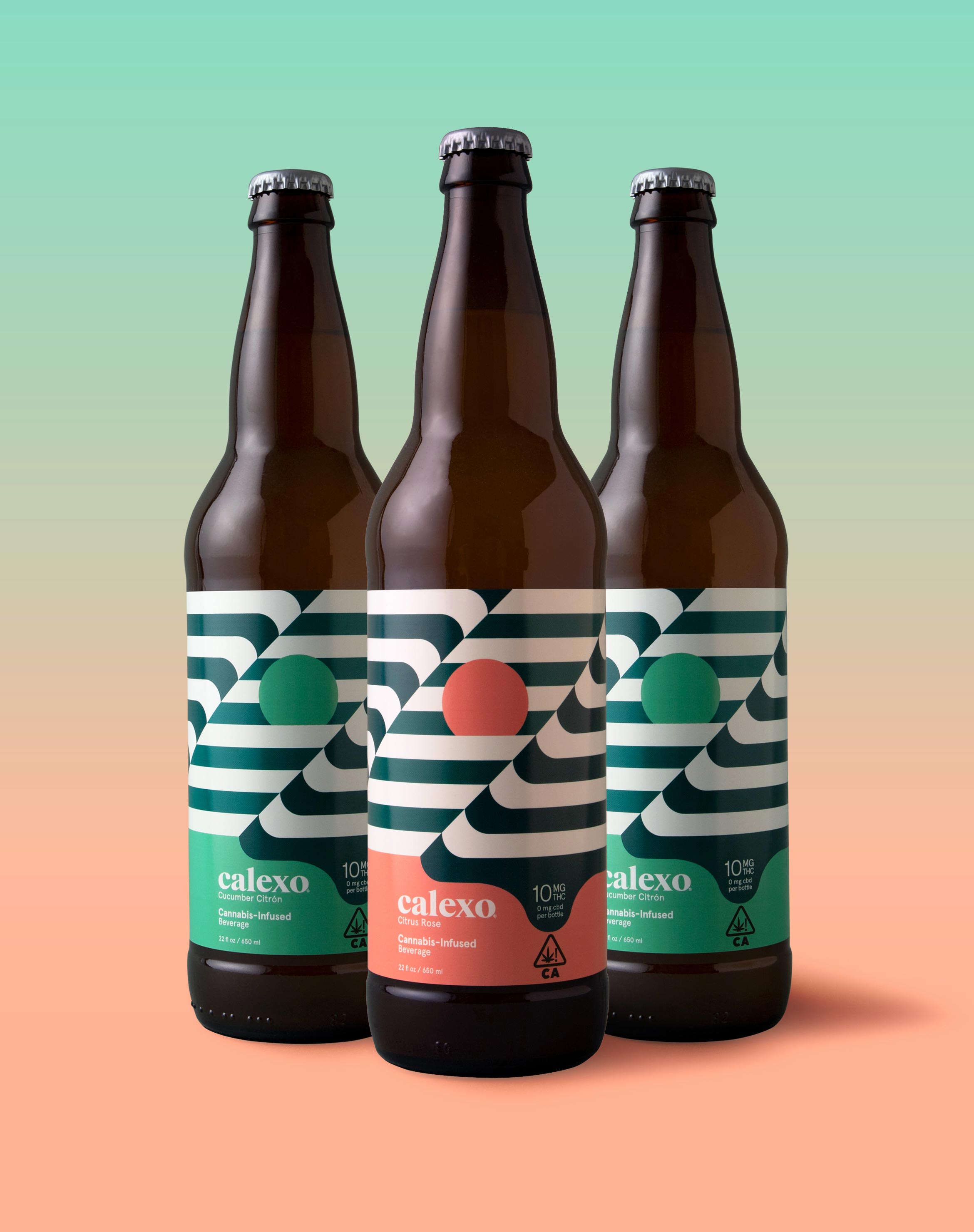
Capturing the laid-back feeling of the rolling hills, lapping water, brilliant sunsets and desert flora that defines the California and northern Mexico region, we applied a crisp, warm, color palette to both the brand and its unique flavor profiles.

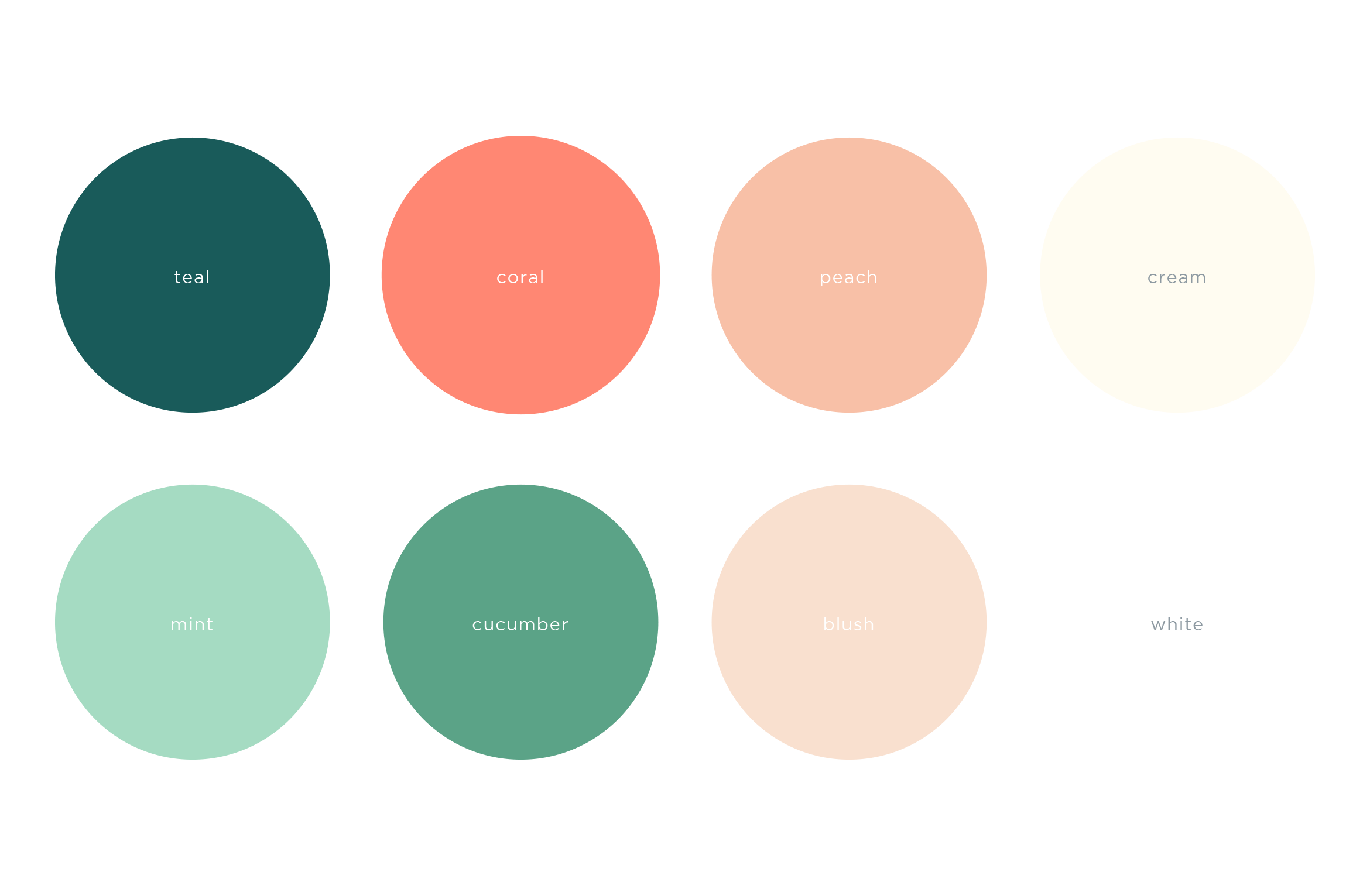

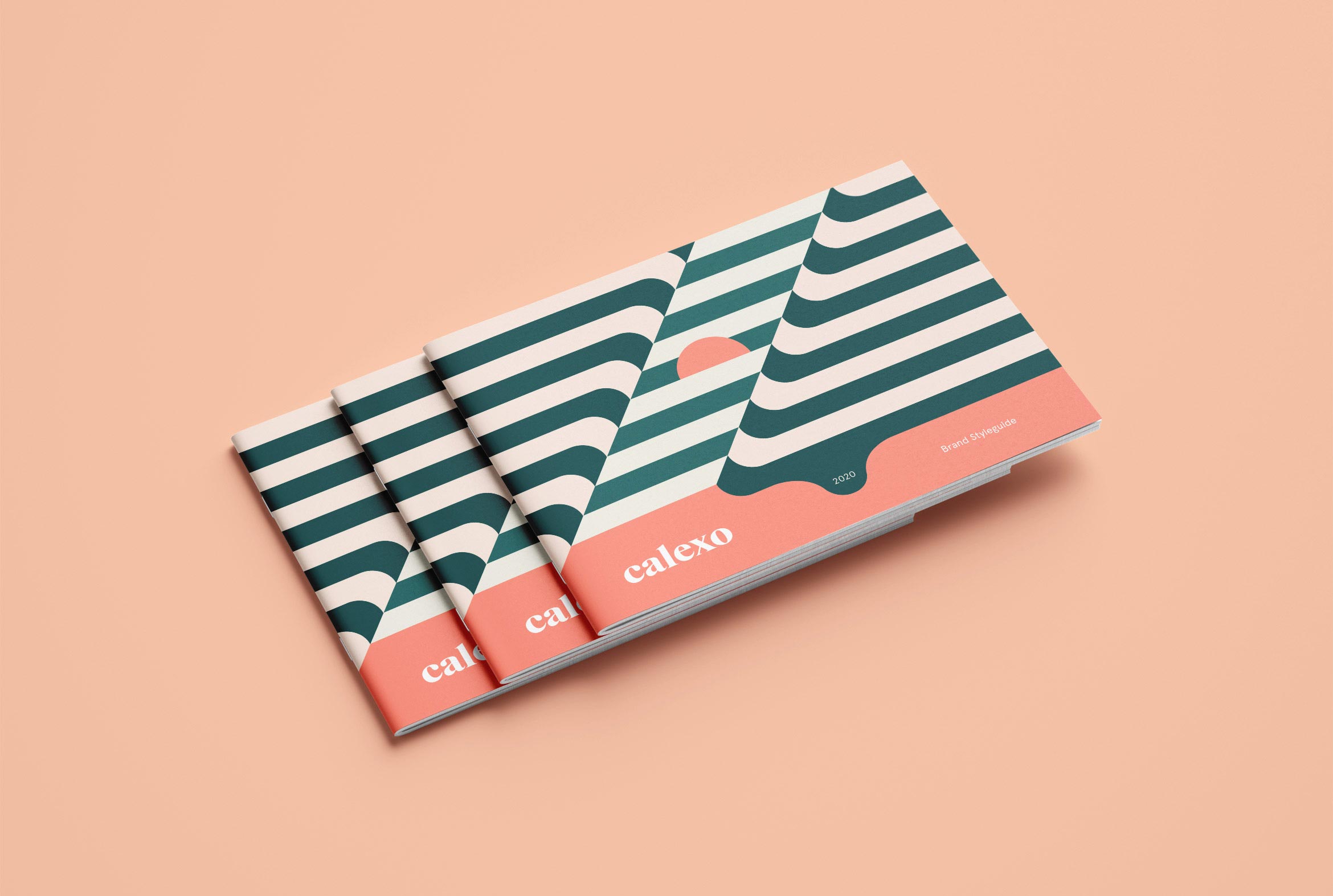
A Brand Styleguide keeps the visual identity cohesive by outlining rules for the logo, typography, color palette and graphic motifs.
Deliverables:
- Brand Identity
- Brand Guidelines
- Packaging Design
- Visual System