How to Work With an Existing Brand Identity
In our creative past working at big ad agencies in New York, we’d often receive brand guidelines from the corporate office and be required to work with them. When creating our ad campaign or direct mail piece, part of the assignment was to ensure all guidelines were being followed for logo position, color palette, typography, layout style, photography style, etc. It’s challenging and fun to be given a certain set of rules to work within and we feel there’s an art to following guidelines.
Today, we sometimes work with companies who want to redesign their website, but not their brand identity. So, what do you do? You need to be able to take what they have and expand on it, evolve it and make it look new, yet retain the origins so it looks like it came from the same company. This can be done in many ways, but they all have something in common: determine the essence of the brand and present that in the best possible way. Here are 4 things you want to look at and questions you might ask yourself:
1) LOGO – Figure out a new way to present it:

– Does it go inside a shape?
– If it’s inside of a shape, do you take it out?
– Can you crop it differently?
– Do you add more “air space” around it to give it a different feeling?
– Could the logo be smaller or set on a new background color?
– Does it even need the name next to it?
2) COLORS – Figure out what the color palette is:

– What is the main brand color?
– Are there too many colors being used?
– Could the palette be simplfied?
– Could you add another color to evolve the palette, yet still retain its origins?
3) TYPOGRAPHY – Pick a nice typeface for the brand:

– Choose a custom web font that helps illustrate the brand’s personality
– How are the headlines typeset?
– What size font are you using?
– What combinations of fonts work best together?
4) LAYOUT – present the elements in a new way:
– What grid system will you use?
– What is the main focal point on the page?
– Will the headlines be prominent or the photography?
– How does the logo and navigation look flush left, right or centered?
…………………………………………………………………………………………………..
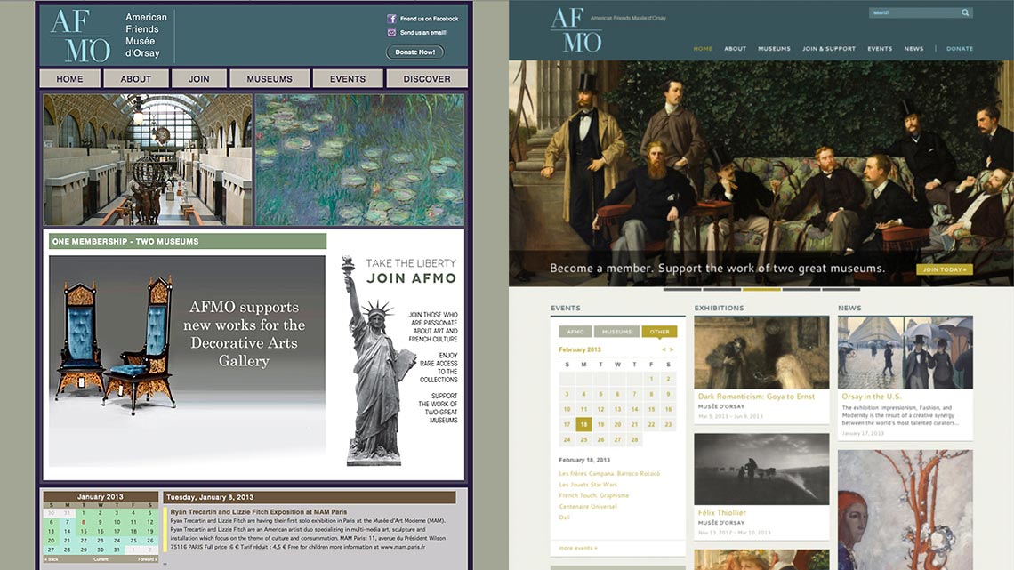
Example 1 : American Friends Musee d’Orsay – Before / After

AFMO’s logo and color palette was designed for them by Musee d’Orsay and it was important to keep this on the new site. When asked to redesign their site, we completely reorganized their content and utilized the gorgeous artwork they had in their library to create a visually dynamic and sophisticated look. The logo was removed from the boxed-in header and the tagline was treated differently, giving the logo space to “breathe” which immediately gives it a new feeling. We determined that the main brand colors were teal and light blue. The beige background was lightened to create a neutral canvas for the paintings, and we decided to stay away from the Eggplant Purple (which tends to feel young) and the Olive green (which felt a little drab.) Light Blue was also used for hover styles.
When looking at the artwork of this era, most of the painters are using Yellow Ochre. We decided to introduce this to the color palette for headlines and buttons. It picks up the color in the paintings beautifully and creates an overall cohesive look. In this way, we breathed new life into their existing brand identity and presentation.
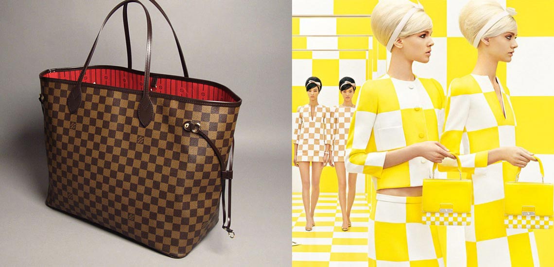
Example 2 : Louis Vuitton – Old / New

Another great example of this on a global scale is the Louis Vuitton Spring 2013 collection by Marc Jacobs. Working with the original Damier signature pattern created in 1889, he modernized the checkerboard by doing a hybrid “mod meets twenties” collection that plays on the idea of repetition. Girls wore coordinating outfits and came down escalators two-by-two to create a much buzzed-about show. The point is, he’s working with a brand with strong heritage but every season continues to use the existing patterns and motifs to create something new and exciting. And it all still feels like LV.