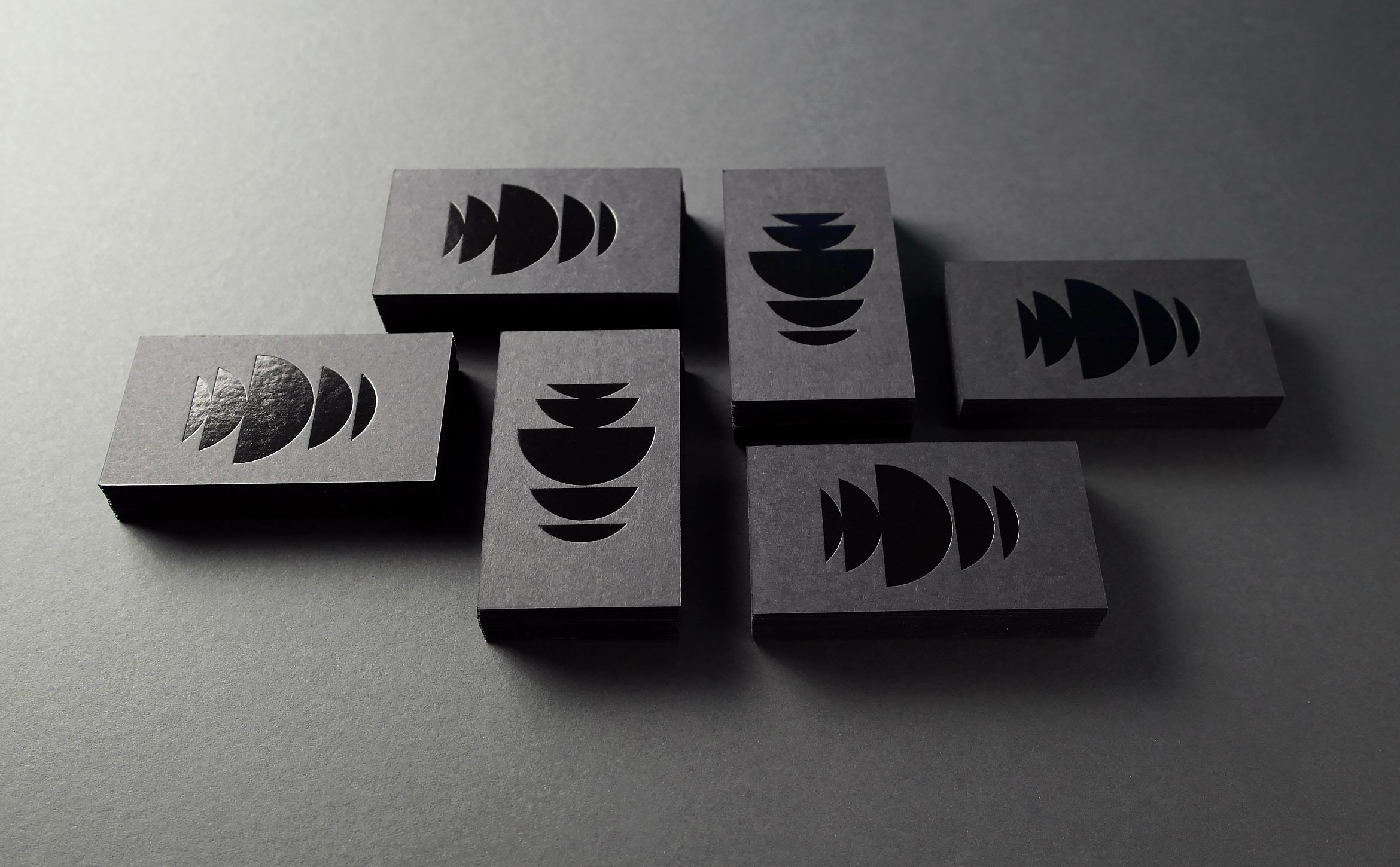

Demarest empowers great ideas in film and technology to deliver content
Demarest is a unique film and television production company that also invests in technologies that create and deliver premium content across all mediums. They wanted to remove the “films” from their name and redesign their identity to better reflect their innovative business model.
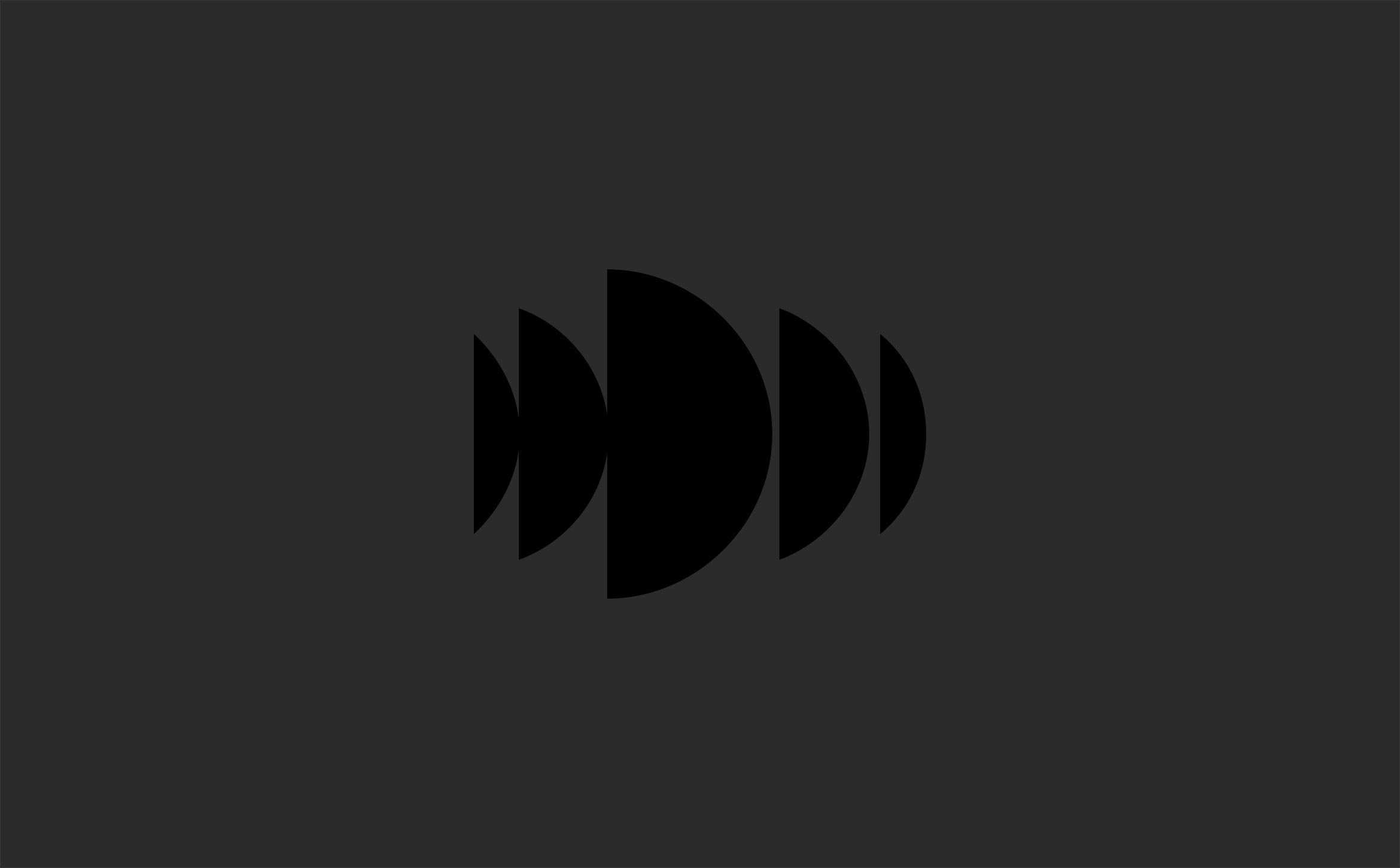

The mark is composed of bisected circles that echo the letter “D”, creating an innovative wave pattern that’s full of motion and energy reminiscent of light refracting on dark water.


The name Demarest means “of the swamp” in French. Images of water and nature combined with pattern motifs evoke a mysterious place where ideas are born. Moody images help bring a responsive WordPress site to life.


Deliverables:
- Brand Identity
- Brand Styleguide
- Website Design
- Business Cards
- Content Creation
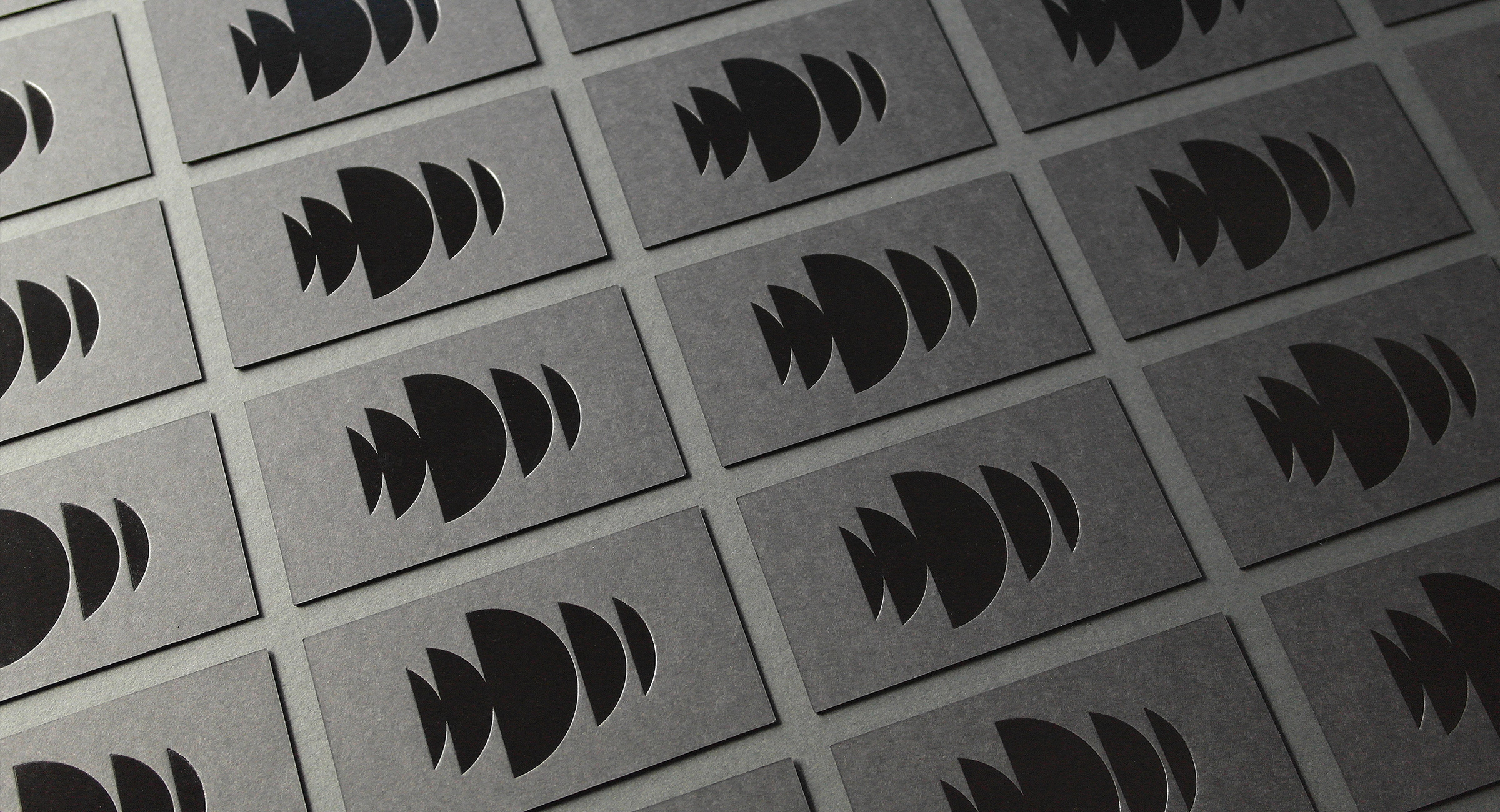
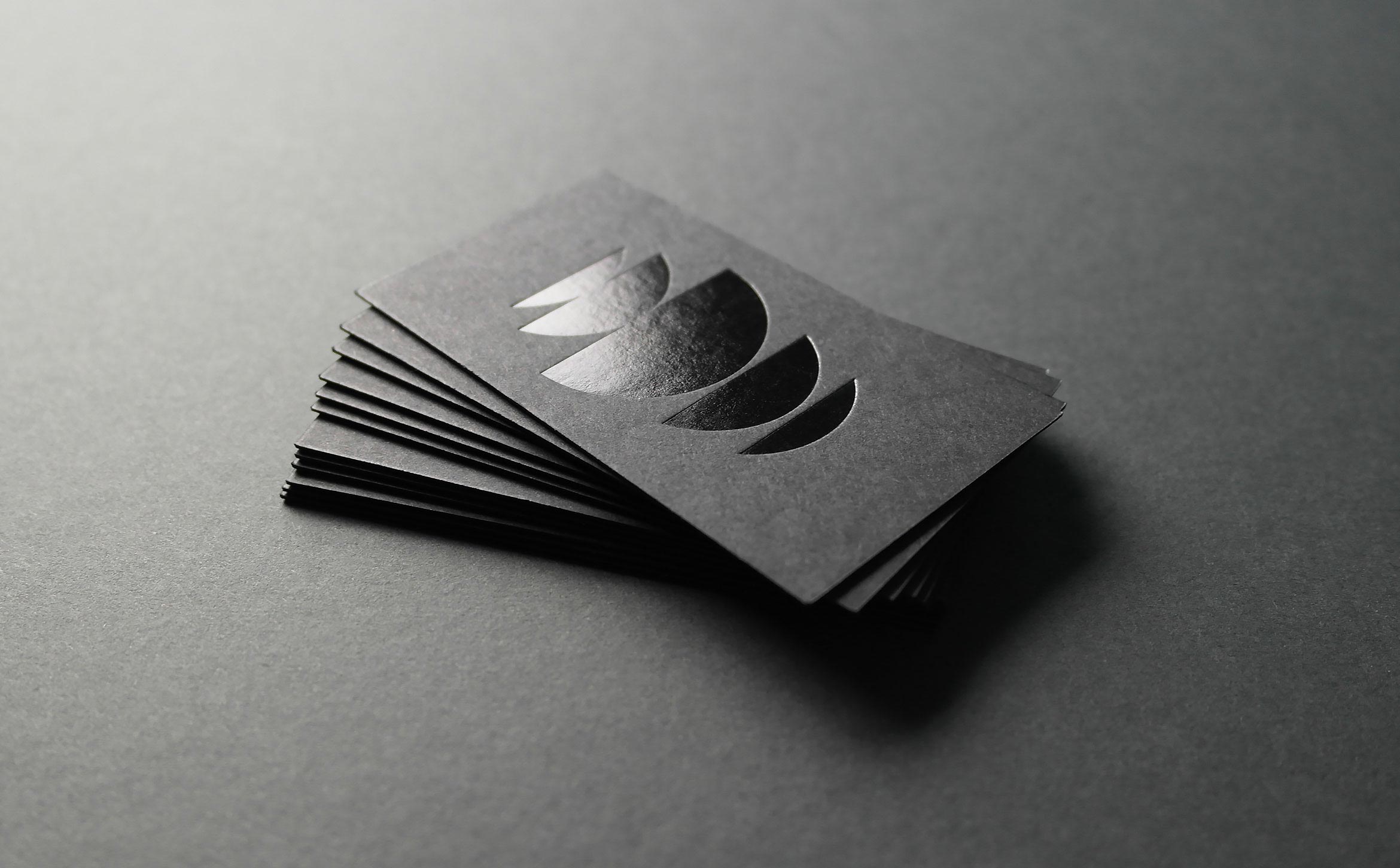
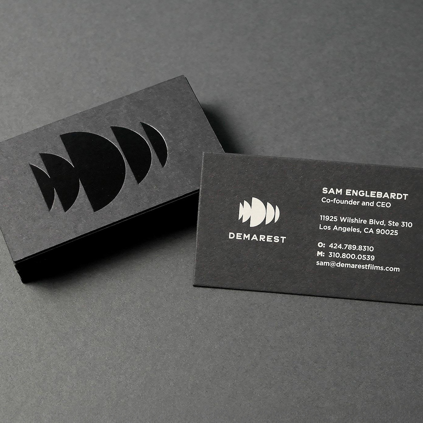
We designed dark and mysterious business cards for the team. Cards are printed using duplexed French Muscletone stock with black foil embossed on the front and silkscreened pale gray ink on the back.
