What to Think About When Redesigning a Brand Identity.

MOO recently caught up with us to find out what it takes to redesign your brand identity. Refreshing your brand identity is a great way to infuse new energy into your company, expand your customer base and change how your company is perceived in the marketplace. But there’s a HUGE difference between refreshing your brand identity and refreshing your brand.
Your brand identity is the outward visual appearance of your business. So whilst a thorough brand refresh (rethinking your brand positioning, your target audience, maybe even your core values) is likely to involve a good deal of structural change, updating your identity is more cosmetic. But that’s not to say it’s any less important (in fact the two go very much hand-in-hand) and it’s this that we’re going to focus on here.
1. Heritage: Respect the DNA
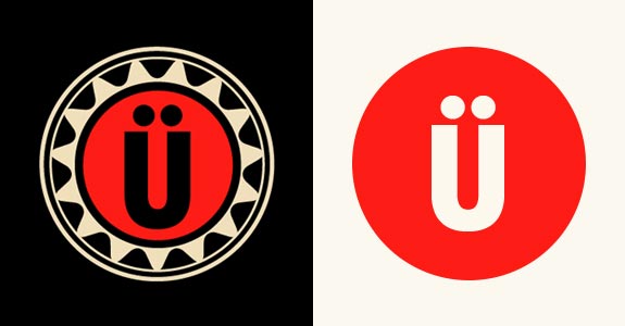
Does the brand identity already have equity in the marketplace? No matter how outdated it is, if people know it, that’s the most valuable part of it. Use it to your advantage.
Rather than ditching your logo in its entirety, see what you can take from it. More often than not, there’s a glimmer of hope and an idea that can be pulled from it (a curve, a color, a symbol or shape). Respect the consumer: they’ve often lived with the identity for years or generations and it has become part of their lives – consciously or not. Retaining a link to the brand’s past and maintaining a thread of consistency is very important. We’re talking about a makeover, not plastic surgery.
Granted, social media and crowdsourcing has increased the criticism of every brand redesign out there, but perhaps that’s even more of a reason to respect the DNA – you’re being watched. It’s okay to rock the boat, just make sure people can recognize the boat you’re rocking.
2. Follow Design Principles
Brand Positioning: Smart design starts here.If you’re not approaching your design through a considered brand positioning statement, you’re not thinking. No matter what you design, always be able to track it back to the brand’s personality and core essence.
Timeless Concepts: As much as you want to fit in with the latest, shiny trends – resist. It will pass and so will your identity. Instead, think about logos that have endured for generations. It’s difficult to predict, but a safe bet is to to be inspired by design masters and products that have achieved timelessness over and over – Rand, Bass, Vignelli, Rams. They all used classic shapes, monograms and ideas that created a feeling and iconic mark that stands the test of time.
Simplicity: Don’t make people think! Less is more. Simple, iconic marks or logotypes are the most effective as they are easily understood, legible and flexible in many mediums. Simplicity is also the most complicated and difficult thing for a designer to achieve.
Color Palette: This comes from examining the DNA of a brand. Is there a brand color that is recognizable to their customer? Is there any equity to keep? This is very important because color is often the first thing the eye recognizes. For a newer company, sometimes extending the color palette can create a new excitement to the brand’s personality.
Typography:Think outside the Helvetica.Your best (and most expensive) bet is to commission a custom typeface that belongs to only your brand. Of course, there are thousands of existing typefaces to choose from, just make sure to err on the side of legibility. And stay away from typography trends as there will be another one next month. Take a look at altering letterforms or modifying the type in a way that makes it unique to your brand and creates something you can own.
3. The Visual Identity System
Once you’ve developed your brand identity, how you use it is crucial. These simple tips will ensure that hard refresh work is worth it.
Versatility: The mark and logo needs to lock-up in various ways and in various sizes. Sometimes you need to create a tiny version of a logo in order to retain any details or to avoid funky space issues between shapes. Always think about where the logo will be seen. It should look as good in black & white on a fax (yes, a fax) as it does in full color on a website or large on a truck that’s driving by.
Iconic Extensions: Sometimes an iconography system or pattern motifs can be created out of the main mark to help depict different aspects of the company’s business. Take a look at how color and layout is used to create interesting brochure covers, background graphics and motifs that can be used across all marketing materials.
Photography: Style of photography for product and lifestyle images can help define the look & feel of your brand. Photography plays a major role on websites, ads or brochures and can create a unique tone that really stands out.
Consistency is Key: Creating a Brand Styleguide from the logo and identity elements is very important in presenting a consistent look and feel across all mediums. Consistency equals professionalism, and a brand identity style guide ensures that everyone, from your employees to your vendors, knows the rules and how to apply them.
4. Don’t Make Your Logo Bigger. Make it Better.
Updating your brand identity is the opportunity to design something really great – so make the most of it. Push the limits, look at it from different angles, challenge yourself and the consumer.
Not everyone embraces change – for every person who raves about your new identity there’ll be someone else with an ‘if it ain’t broke’ attitude. But that’s OK. As Tibor Kalman once said, “…when you make something no one hates, no one loves it.” And he should know because he was one of the greatest graphic designers of all time – fact!
Whether you’re just adding a little polish to an existing identity or bending it enough to spark a reaction, just make sure you’re always approaching it with a strong dose of respect, solid design principles and reality-based thinking. And always remember, a logo is only as good as the brand behind it.